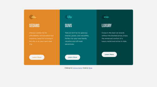
Submitted about 3 years agoA solution to the 3-column preview card component challenge
Responsive 3-column challenge using flex

@ttaammaarr
Solution retrospective
Is there a way to align all buttons to be at the same vertical position? The paragraphs contain a different amount of words, when resizing the browser, this causes some alignment issues with the buttons. Any tips or advice is appreciated!
Code
Please log in to post a comment
Log in with GitHubCommunity feedback
- @Bayoumi-dev
Hey Tamar, It looks good!...
My suggestion:
- Using more than one
<h1>is allowed by the HTML specification, but is not considered a best practice. Using only one<h1>is beneficial for screenreader users.
---> Multiple
<h1>elements on one pageHope this help!... Keep coding👍
Marked as helpful - Using more than one
- @Akhlak-Hossain-Jim
Nice work. For that you can do:
- set a fixed bottom padding,
- take a div with
display: flex;forpand thebuttonand - make
flex-direction: column; justify-content: space-between;
or
- in
sectionadddisplay: flex; flex-direction: column;, - select
imgand addwidth:64px;height:auto; - in
buttonaddmargin-top:auto;
and it should always stay in the same position.
Happy coding :)
Marked as helpful


Join our Discord community
Join thousands of Frontend Mentor community members taking the challenges, sharing resources, helping each other, and chatting about all things front-end!
Join our Discord