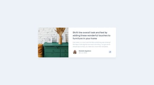
Responsive Article Preview Component using CSS Grid and CSS Flexbox

Solution retrospective
I’m most proud of how well the design and functionality came together. The layout is clean and responsive, adapting smoothly across different screen sizes. The animation effects on the share button also enhance the user experience by making the transition feel fluid and natural. Additionally, I was able to use semantic HTML and maintain a well-structured CSS file, making the code easy to read and modify.
What I Would Do Differently Next Time
-
Improve JavaScript Logic: Instead of manipulating classList.value directly, I would use classList.toggle() for better readability and maintainability.
-
Add More Interactivity: I could enhance the experience by adding a tooltip for the share button or displaying the share options in a more intuitive way.
- Challenge:
-
The layout looked great on mobile, but on larger screens, the positioning of the share popup was inconsistent.
-
The slide-in and slide-out animations for the share section weren’t smooth at first, causing flickering or abrupt movements.
- Solution:
-
I adjusted the position properties in CSS and used @media queries to ensure the share popup was positioned correctly on different screen sizes.
-
refined the keyframes, adjusted the easing function, and added opacity transitions to make the animation smoother.
-
Currently, I’m using a ternary operator to toggle the share popup, but I feel like there might be a cleaner way to handle this. Would using classList.toggle() be a better approach, or is there an even more efficient way to achieve this?
-
The slide-in and slide-out animations work well, but I’d love feedback on making them even smoother. Are there better easing functions or techniques to create a more polished transition effect?
-
Are there any improvements I could make in the HTML, CSS, or JavaScript to make my code cleaner and more maintainable?
Please log in to post a comment
Log in with GitHubCommunity feedback
- @Annalyza106
Great take on the challenge, an area I'd to see better though is the transition. It's a lovely touch, yet can be a little bit more subtle.

Join our Discord community
Join thousands of Frontend Mentor community members taking the challenges, sharing resources, helping each other, and chatting about all things front-end!
Join our Discord