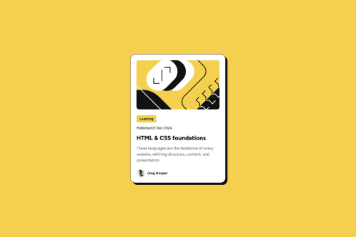
Responsive blog preview card

Solution retrospective
One of the key challenges I faced was achieving the right font scaling for small screens without using media queries, as suggested in the challenge brief.
I began by researching fluid typography and found an article on web.dev that helped me understand how to use clamp(). From there, I experimented with different preferred value expressions to fine-tune the scaling. It was tricky to get it just right. I wanted the text to scale smoothly starting at a 375px viewport and increase fairly quickly to the maximum text size by 430px viewport, since that’s the narrow range where the card itself resizes.
After testing various approaches, I achieved a scaling that felt smooth, natural, and aligned with the intended design.
Please log in to post a comment
Log in with GitHubCommunity feedback
- @leopoldhorne
It looks great! Job well done. I don't have much constructive feedback for you; however, I enjoyed reading how you dealt with the challenge of fluid text across various viewport sizes.

Join our Discord community
Join thousands of Frontend Mentor community members taking the challenges, sharing resources, helping each other, and chatting about all things front-end!
Join our Discord