Responsive Blog Preview Card Solution - frontend experiment

Solution retrospective
Frontend Mentor - Blog Preview Card Solution
This is a solution to the Blog preview card challenge on Frontend Mentor.
Table of contents
Overview
The challengeUsers should be able to:
See hover and focus states for all interactive elements on the page.
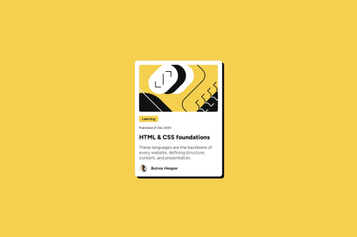
DescriptionThis project involves building a blog preview card that closely follows the design provided in the challenge. The card displays an article's title, description, publication date, and author's avatar. The design includes interactive elements, such as a hover effect on the button and focus states on clickable elements.
The goal is to practice basic HTML and CSS concepts like semantic markup, layout techniques, and hover/focus interactions.
The design provided in the challenge includes both mobile and desktop views, and the layout needs to be responsive, with the card adjusting itself based on screen size. The card also includes an image, a button, and a footer with the author's avatar and name.
This project is deployed automatically using GitHub Actions to Vercel. The deployment process triggers whenever changes are pushed to the main branch of the repository. The GitHub Actions workflow installs the necessary dependencies, builds the project, and deploys it to Vercel, making it accessible online.
Project structure:
.
├── .github
│   └── workflows
├── assets
│   ├── fonts
│   │   └── static
│   └── images
- Live Site URL: Blog Preview Card Live. Live site link may expire as vercel app access token to my GitHub project is limited.
Installation
To use this project, you can either clone the repository or download the zip files.
-
Clone the repository:
git clone [email protected]:ButrosV/frontend-experiment.git -
Navigate into the project directory:
cd blog-preview-card -
Install the necessary dependencies:
npm install
Usage
To view the project locally, run the following command to start the development server:
npm start
Then, open your browser and go to http://localhost:3000 to see the project running!
IMPORTANT: Ensure that you have Node.js and npm installed. If you run into any issues while setting up, feel free to reach out for support.
My process
Built with- Semantic HTML5 markup
- CSS custom properties
- CSS Grid
- Styled Components - For styles
- GitHub Actions - For automating deployment to Vercel
- Vercel - For deploying the project
Through this project, I learned to implement hover states, manage responsive design, and effectively use Flexbox and CSS Grid to lay out elements.
Continued developmentI plan to improve the interactivity of the blog card by adding animations and further enhancing accessibility.
Useful resources- Frontend Mentor Community - For helpful discussions and feedback.
Author
- Butros - Coded this project.
Acknowledgments
A big thanks to Frontend Mentor for the challenge and all the resources they provided.
Please log in to post a comment
Log in with GitHubCommunity feedback
No feedback yet. Be the first to give feedback on ButrosV's solution.
Join our Discord community
Join thousands of Frontend Mentor community members taking the challenges, sharing resources, helping each other, and chatting about all things front-end!
Join our Discord