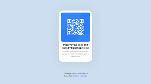
Responsive card using media query, CSS and HTML

Solution retrospective
- At first I had a hard time in media queries but I get the style of what I want in specific screen.
- None
- Yes, regarding the standard size of screen using media queries.
Please log in to post a comment
Log in with GitHubCommunity feedback
- @correlucas
👾Hi @iamMervz, congratulations on your solution!👋 Welcome to the Frontend Mentor Coding Community!
Great solution and a great start! From what I saw you’re on the right track. I’ve few suggestions for you that you can consider adding to your code:
Your solution is great and the code is working, but the HTML structure can be reduced by removing unnecessary divs, all you need is a single
<main>
or<div>
to keep all the content inside, and nothing more. The ideal structure is thediv
and only the image, heading, and paragraph.Here’s one example to show can be cleaner this HTML structure:
<body> <main> <img src="./images/image-qr-code.png" alt="QR Code Frontend Mentor" > <h1>Improve your front-end skills by building projects</h1> <p>Scan the QR code to visit Frontend Mentor and take your coding skills to the next level</p> </main> </body>
To reduce the CSS you can use the direct selector for each element instead of using
class
this way you have a code even cleaner, for example, you can select everything using the direct selector for (img, h1, and p, main).Here's my solution for this challenge if you wants to see how I build it: https://www.frontendmentor.io/solutions/qr-code-component-vanilla-cs-js-darklight-mode-nS2aOYYsJR
✌️ I hope this helps you and happy coding!
Join our Discord community
Join thousands of Frontend Mentor community members taking the challenges, sharing resources, helping each other, and chatting about all things front-end!
Join our Discord