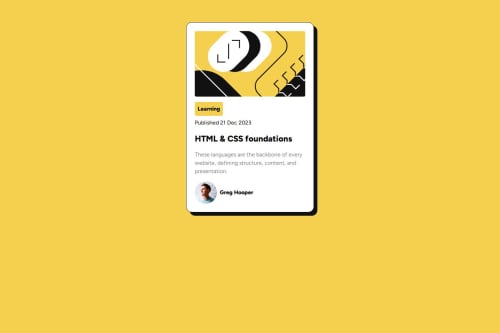
Submitted over 1 year agoA solution to the Blog preview card challenge
Responsive card with flow layout and flexbox

@daniel-howorth
Solution retrospective
What specific areas of your project would you like help with?
How can I make the profile image more responsive?
Code
Couldn’t fetch repository
Please log in to post a comment
Log in with GitHubCommunity feedback
- P@huyphan2210
Hi, daniel-howorth
You did well on this challenge
I'd like to make some suggestions:
- Make html and body tag have "min-height: 100vh" instead of "height: 100%" to make it fill the whole viewport. And if you want the main tag to fill the body:
-- make the body have "display: flex"
-- make the main tag have "flex-grow: 1", remove the padding
-- make the footer tag have "position: fixed", "bottom: 1vh", left: "50%", and "transform: translate(-50%)"
Afterwards, make the card in the center by applying flexbox or grid to the main tag
I'm not sure what you meant by "make the profile image more responsive", but you can try to search "@media query" on Google.
I hope that this is useful to you
Marked as helpful

Join our Discord community
Join thousands of Frontend Mentor community members taking the challenges, sharing resources, helping each other, and chatting about all things front-end!
Join our Discord