Not Found
Not Found
Not Found
Not Found
Not Found
Not Found
Not Found
Not Found
Not Found
Not Found
Not Found
Not Found
Not Found
Not Found
Not Found
Not Found
Not Found
Not Found
Not Found
Not Found

Submitted

responsive flex price component
Tiass 295

@Tiasstiass

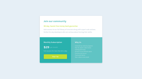
Desktop design screenshot for the Single price grid component coding challenge

This is a solution for...

  • HTML
  • CSS
1newbie
View challenge

Design comparison


SolutionDesign

Solution retrospective


Let me know what could be done easier. Every feedback appreciated

Community feedback

P
tediko 6,680

@tediko

Posted

Hello, Tiass! 👋

Good job finishing this challenge. Your website responds well and there is nothing much to add. What i can suggest is:

  • Each <section> should be identified, typically by including a heading as a child of the <section> element. Your .row container doesn't meet this criteria. Add section to your .bottom-left/right maybe.

Good luck with that, have fun coding! 💪

1

Tiass 295

@Tiasstiass

Posted

@tediko thanks for the feedback and the infos! Is there a way to put things aside without including them in the same div? Thats where my confusion comes from.

0
P
tediko 6,680

@tediko

Posted

@Tiasstiass It could be done with grid, but your approach is good too. There is nothing bad with one more container if its needed.

0
T
ApplePieGiraffe 30,545

@ApplePieGiraffe

Posted

Yeah, great job, Tiass! 👍

Your solution looks good and is responsive! 👏

Keep coding (and happy coding, too)! 😁

0

Tiass 295

@Tiasstiass

Posted

@ApplePieGiraffe thanks for the feedback, appreciate it.

0

Please log in to post a comment

Log in with GitHub
Discord logo

Join our Discord community

Join thousands of Frontend Mentor community members taking the challenges, sharing resources, helping each other, and chatting about all things front-end!

Join our Discord