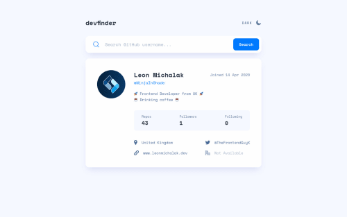
Responsive github API user search api with dark/light theme switch

Please log in to post a comment
Log in with GitHubCommunity feedback
- @bramuccci
Hi Leon, this solution looks amazing! I see it in the newsletter and I think it's great. In fact, I'm studying it so thanks for the readme!! The dark and light theme looks amazing too, just a question: The theme preference is not saved in the localStorage? When I reload the page, is always dark. Please keep coding! This is awesome.
Marked as helpful - @mattstuddert
Nice work on this challenge, Leon. You've done an awesome job!! 👏
Your solution looks great and responds really well to different screen sizes. I'd recommend reviewing the accessibility and HTML validation reports to try to resolve those issues.
Also, here are a couple more pointers:
- In my opinion, you're overusing heading elements in this app. I'd say only the name (
h1) and the repos, following, and followers (allh2s) are headings in this design. Heading are supposed to provide an outline for the content and act as titles for specific regions. In this design, the name is the main heading for the card, and the others are headings for the stats. None of the other content makes sense as a heading. - This is purely semantics, but I'd say a
ulwould be best for the information at the bottom of the card. It would also help screen reader users by announcing "List item 1 of 4", etc.
I hope that helps. You've done a brilliant job. Keep up the great work! 👍
Marked as helpful - In my opinion, you're overusing heading elements in this app. I'd say only the name (


Join our Discord community
Join thousands of Frontend Mentor community members taking the challenges, sharing resources, helping each other, and chatting about all things front-end!
Join our Discord