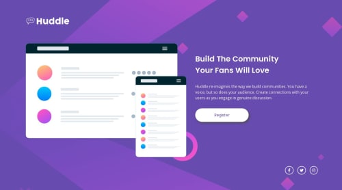
Submitted almost 2 years agoA solution to the Huddle landing page with a single introductory section challenge
Responsive Huddle Landing Page made with Vanilla CSS

@archihalder
Solution retrospective
I was unable to fix the background image properly (especially for the mobile view especially). I would love to get some help on this.
- I noticed one thing. If the illustration image is removed, then the background image doesn't change.
- I don't know what happens if we place an image on top of a background image. The background image doesn't respond very well. ( I tried using z-index as well, but nothing happened )
Any other feedback on the project is also welcome.
Code
Please log in to post a comment
Log in with GitHubCommunity feedback
- @hitmorecode
Congratulations well done, good effort. As for the background problem, here is why
/* remove center center, add min-height: 100vh. this should solve the background issue */
body {
    background: url("/images/bg-desktop.svg") no-repeat;
    -webkit-background-size: cover;
    -moz-background-size: cover;
    -o-background-size: cover;
    background-size: cover;
    background-color: var(--clr-primary-500);
    min-height: 100vh;
}
Remove the body from the first media query and place it inside the second media query. In de second media query change max-width to 380px
/* remove what's commented out */
@media (max-width: 380px) {

        body {
        background: url("/images/bg-mobile.svg") no-repeat;
/*        -webkit-background-size: cover; */
/*         -moz-background-size: cover; */
/*         -o-background-size: cover; */
/*         background-size: cover; */
        background-color: var(--clr-primary-500);
    }
This should do the trick
Marked as helpful

Join our Discord community
Join thousands of Frontend Mentor community members taking the challenges, sharing resources, helping each other, and chatting about all things front-end!
Join our Discord