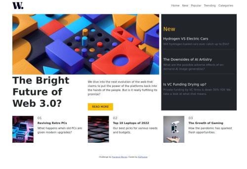
Responsive Landing Page using Bootstrap

Solution retrospective
I made two html files, one was styled using plain css and another using bootstrap. I chose to deploy the bootstrap file on github pages. I tinkered quite a lot with different grid methods. I was able to get the main and footer section to align using plain css via grid-template-areas/ grid-columns etc. I was unable to align them using bootstrap. In order to achieve a perfect alignment for the last footer element, I had to remove its padding. This looked good on larger screen sizes but became mis-aligned once more on mobile sizes. Can you please share best practices on multiple grids alignment.
Please log in to post a comment
Log in with GitHubCommunity feedback
No feedback yet. Be the first to give feedback on DaFlusher's solution.
Join our Discord community
Join thousands of Frontend Mentor community members taking the challenges, sharing resources, helping each other, and chatting about all things front-end!
Join our Discord