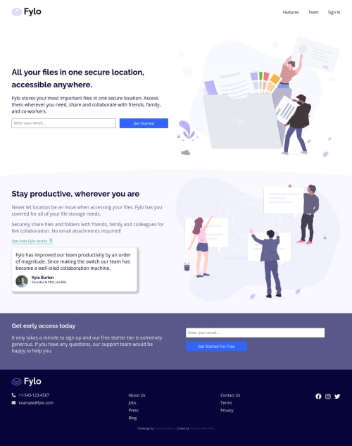
Submitted about 4 years agoA solution to the Fylo landing page with two column layout challenge
Responsive landing page using only flexbox

@MohamedBehhar
Solution retrospective
Hy again, I'm definitely happy with the result, but not very happy code I did my best to make it as clean and dry as possible, but I didn't think that I succeeded. Difficulties: I found some difficulties in positioning the background and make it similar to the one on the design. My question: How I can I get my code more organized and dry? And thank you.
Code
Please log in to post a comment
Log in with GitHubCommunity feedback
- @pikapikamart
Hey, great work on this one. Just some additions to what APG said.
- You may want to wrap the email inputs inside
formtags. Since they are supposed to submit your email right in some route, it needs to be insideformtags. Change as well the button next to it as abuttonand notatags. You want to do this both in the header and near footer email inputs.
Really good job on this ^^
- You may want to wrap the email inputs inside
- @ApplePieGiraffe
Greetings, Mohamed! 👋
Good job on this challenge! 👏 Your solution looks nice and is responsive! 👍
I suggest,
- Taking a look at your solution report and trying to clear up some of the errors that are there in order to improve the accessibility of your solution. Looks like you need to label the input elements on the page in some way. 😉
- I think the positioning of the background shape is okay—just adding a little more padding inside some of the sections of the page might be a good idea so that stuff has more space around it.
- Perhaps considering using a single
<h1>tag per page (as that's commonly recommended best practice, at the moment) rather than more than one. Some less-important heading tags (such as<h2>or<h3>) for other headings besides the main heading of the page might work better.
Keep coding (and happy coding, too)! 😁


Join our Discord community
Join thousands of Frontend Mentor community members taking the challenges, sharing resources, helping each other, and chatting about all things front-end!
Join our Discord