Latest solutions
Latest comments
- @MohamedBehhar@MohamedBehhar
Thank you very very much for this explicit comment, i'll do my best to make my works looks better.
- @yanaantonna@MohamedBehhar
hey Yana, for your first challenge I think that you did a good job, otherwise, I see that you forget to give a border-radius for the card's parent, and also the background color didn't match the one on the design. For the mobile version, I think it's better to reduce the margin between elements ( h1, p , and img) to make the design more beautiful. At the end, I'll be happy if you took a look at one of my projects and give me some advice to make it even better.
- @NitaLewska@MohamedBehhar
hello Anna, I see that your card isn't in the center because you choose display flex for the body which contains "the card" and the attribution on the bottom. I think you should add " flex-direction : column" that's will make both the card and the attribution centered. Otherwise, I think that you should start using variables for the colors and the font at the top of your CSS file, it will help you a lot.
- @PriscaTonia@MohamedBehhar
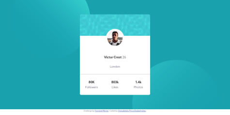
Hello Prisca, big up for the good work. I don't think that you need to specify a height or width for the container, at least this is what I did, you can use padding instead to create some space between text elements. You can check my repo to see how I did it it may help you : https://github.com/MohamedBehhar/Profile-Card-Component
- @MohamedBehhar@MohamedBehhar
Thanks a lot sir for your feedback, I really appreciate it, I'll try to remake it without specifying a height for the card and see how it will look. Have a nice day sir.
- @yeseniamolinab@MohamedBehhar
this looks great, I'm still struggling with the mix-blend-mode property , I think you forget the border-radius of the card.


