Not Found
Not Found
Not Found
Not Found
Not Found
Not Found
Not Found
Not Found
Not Found
Not Found
Not Found
Not Found
Not Found
Not Found
Not Found
Not Found
Not Found
Not Found
Not Found
Not Found

All comments

  • Mohamed• 325

    @MohamedBehhar

    Submitted

    Hy developers, hope you all are doing well, this my solution for The Accordion FAQ challenge, i struggled to make the accordion close when Im clicking on another question, I'll be grateful if someone can help me with that.

    Mohamed• 325

    @MohamedBehhar

    Posted

    Thank you very very much for this explicit comment, i'll do my best to make my works looks better.

    0
  • Yana Antonna• 20

    @yanaantonna

    Submitted

    This is my first project on Frontend Mentor. Could you please provide me some feedback on the work I have done. Tkank you.

    Mohamed• 325

    @MohamedBehhar

    Posted

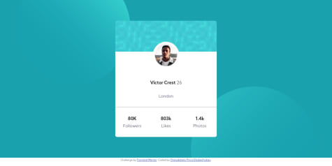
    hey Yana, for your first challenge I think that you did a good job, otherwise, I see that you forget to give a border-radius for the card's parent, and also the background color didn't match the one on the design. For the mobile version, I think it's better to reduce the margin between elements ( h1, p , and img) to make the design more beautiful. At the end, I'll be happy if you took a look at one of my projects and give me some advice to make it even better.

    0
  • Anna• 545

    @NitaLewska

    Submitted

    Hi! I'm studying WebDev for 3 month, and this is my first challenge done. The first project for my portfolio. I am not a pro member, so my solution is far from "pixel perfect", but still I hope that it's good enough.

    Please, dont hesitate to comment, as I'm eager to find friends in WebDev community and I'm ready to hear any advice or critic=)

    Mohamed• 325

    @MohamedBehhar

    Posted

    hello Anna, I see that your card isn't in the center because you choose display flex for the body which contains "the card" and the attribution on the bottom. I think you should add " flex-direction : column" that's will make both the card and the attribution centered. Otherwise, I think that you should start using variables for the colors and the font at the top of your CSS file, it will help you a lot.

    0
  • Mohamed• 325

    @MohamedBehhar

    Posted

    Hello Prisca, big up for the good work. I don't think that you need to specify a height or width for the container, at least this is what I did, you can use padding instead to create some space between text elements. You can check my repo to see how I did it it may help you : https://github.com/MohamedBehhar/Profile-Card-Component

    0
  • Mohamed• 325

    @MohamedBehhar

    Submitted

    Hello guys, this is my first challenge on Frontend Mentor after learning HTML and CSS for few months, I would like to ask you about the usage of the HTML <picture> that I want to use to specify "img" for phone and desktop but I failed. Also, I'm confused about the usage of "px" or "vw & vh" to specify the height and the width of the card. My last question is about the "overflow: hidden" that I used to make the border of the picture round but on the other hand its affect the text that disappears once reaching the max-width of its parent. I'll be grateful for any advice or remark from you guys, I'm waiting for your feedback.

    Mohamed• 325

    @MohamedBehhar

    Posted

    Thanks a lot sir for your feedback, I really appreciate it, I'll try to remake it without specifying a height for the card and see how it will look. Have a nice day sir.

    0
  • Mohamed• 325

    @MohamedBehhar

    Posted

    this looks great, I'm still struggling with the mix-blend-mode property , I think you forget the border-radius of the card.

    0