Responsive landing page using Sass and Vanilla JS

Solution retrospective
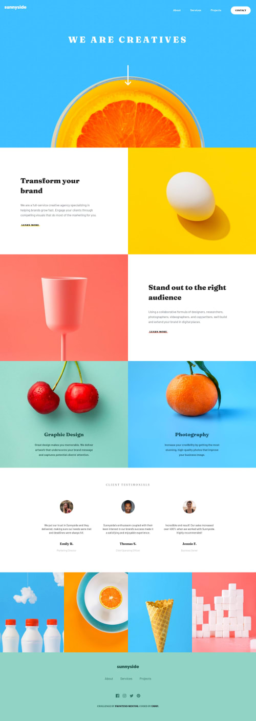
I would love some feedback on how you all were able to achieve the fully rounded border-bottom on the 'Learn More' text! I was only able to get it to round itself out on the bottom half. As always I'm open to any other feedback as well.
Please log in to post a comment
Log in with GitHubCommunity feedback
- @abhijitbcob
the little white triangle in the mobile menu that was nice!
- P@palgramming
I was going to make a color bar with a div and then absolute my text on top of the color bar I was going to create.
- @koikiss-dev
Me encanto la forma tan resumida que hiciste el botón hamburger, no sabía que se podia hacer de esa manera.
Solo tengo una queja, al momento de ir redimensionando el tamaño de pantalla las imágenes del main en el aside van "desapareciendo" y supongo que es porque las tienes con un background-size: cover, pero al momento de llegar al estándar de mobile se ven bien, solo es en el transcurso del redimensionamiento.
edit: en todas las imágenes se ve ese "problema".
Por lo demás te ha quedado hermoso


Join our Discord community
Join thousands of Frontend Mentor community members taking the challenges, sharing resources, helping each other, and chatting about all things front-end!
Join our Discord