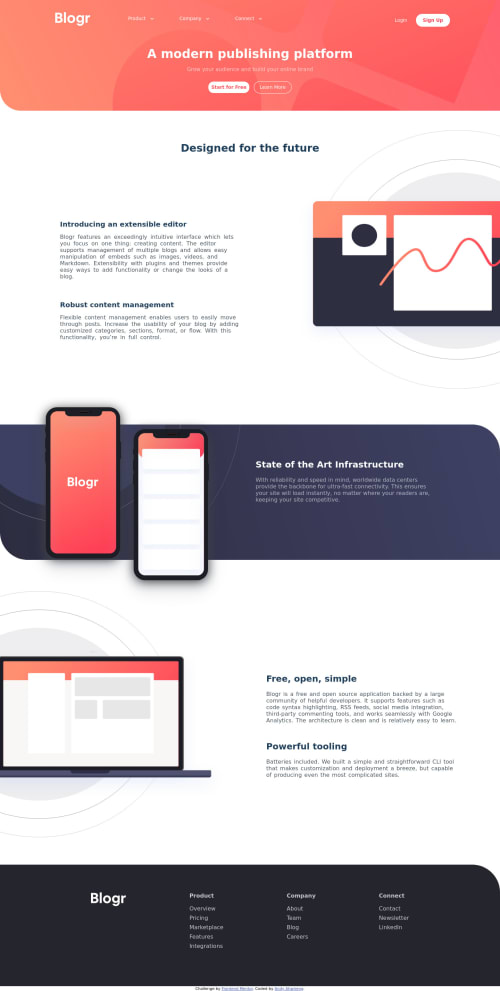
Responsive landing page with javaScript functionality

Solution retrospective
With the arrow beside the nav links, I keep getting errors in the js file so I left it out. But, I would appreciate it if someone could help me rectify the issue. Also any feedback is appreciated.
Please log in to post a comment
Log in with GitHubCommunity feedback
- @Blazing-Mike
Nice attempt Andy.... I'm thinking the arrow could be be a drop-down linked with the HTML or using eventListners to target the arrow( or the whole link) to display the options on click.
You could also adjust your media queries and try using Mobile first principles next time
- P@palgramming
You should change your media query for mobile screens to 700px and not the 480px you have it set cause between 480px and 700px your desktop navigation does not have enough room but changing the break-point fixes your issues


Join our Discord community
Join thousands of Frontend Mentor community members taking the challenges, sharing resources, helping each other, and chatting about all things front-end!
Join our Discord