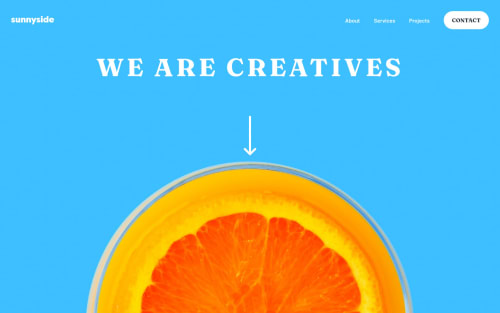
Responsive Landing Page with SCSS and Smooth Scrolling

Solution retrospective
I had fun working on this, even though it took a rather long time. I would like to see others' approaches to learn how to make mine differently next time. Any feedback would be recommended
Please log in to post a comment
Log in with GitHubCommunity feedback
- @ChamuMutezva
- on line 38 in your html file there is a navigation list which is duplicated again from line 65. The reason I see here was to have a navigation for mobile and another one for desktop but with responsive design such cases should be avoided. The navigation can be placed properly using css.
- the hamburger div is supposed to be a button, a div will require a lot more coding for it to be accessible to assistive technology users. Just change the div to be a button and leave the span elements as is. Provide content that can be read a screen reader so that assistive technology users will be able to navigate your site without confusion. In fact they should be a hamburger image in the assets folder. Find about css class Sr-only, so that you can visually hide content but the same content should be read by screen readers
Marked as helpful - @ChamuMutezva
Greetings Udochukwu. I managed to check your site on mobile and it is working fine. Here are some recommendations :
- some of the anchor elements have anchor elements as children, however there is to readable text for assistive technology users.
- the hamburger is a div with span elements inside. Use semantic elements where possible, a div and a span are not interactive elements hence this custom button will not be available to assistive technology users.
- try not to duplicate code, for example there is 2 navigations in the header. Turning off your css will give you the structure of your html.
Join our Discord community
Join thousands of Frontend Mentor community members taking the challenges, sharing resources, helping each other, and chatting about all things front-end!
Join our Discord