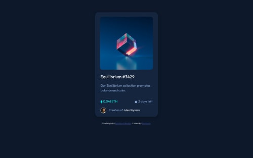
Not Found
Not Found
Not Found
Not Found
Not Found
Not Found
Not Found
Not Found
Not Found
Not Found
Not Found
Not Found
Not Found
Not Found
Not Found
Not Found
Not Found
Not Found
Not Found
Not Found

Submitted

Responsive NFT preview card component

@Abhilash437

Desktop design screenshot for the NFT preview card component coding challenge

This is a solution for...

  • HTML
  • CSS
1newbie
View challenge

Design comparison


SolutionDesign

Solution retrospective


I am a beginner in web development but I have tried my best to comping up with a solution for this challenge, it has a lot of bugs but somehow it still works. Feel free to provide some insights on my solution.

Community feedback

@aditya3284

Posted

Hey Abhilash, good job

Keep up the good work

Your solution looks great however I think that the hr that you are using needs a bit more size or opacity, as its not visible properly. And try to use other units instead of % on your main container, as % changes based on the parent element, in this case parent element is the body and change in its width changes your components width.

@ccreusat has given a good solution of that.

I hope this helps you in your coding journey

Cheers

Happy coding 👍

0

@shashreesamuel

Posted

Hey good job completing this challenge

Keep up the good work

Your solution looks great however I think that the user information needs some margin from the bottom using margin-bottom. Secondly the divider line needs a bit more opacity

I hope this helps

Cheers

Happy coding 👍

0
P

@ccreusat

Posted

Hello ! Good job :)

It looks nice but you can improve your solution if you wants :

  • about your markup, try to stick to the same convention (Title, active, Image, ...): title, active, image, .. Take a look at BEM, OOCSS methodologies
  • Get rid of your width % for your component .container, make it with max-width: 350px and remove height so it could breathe :)
  • max-width: 100% on your main image is a better practice than width: 90%
  • For better UI, you could put your <div class="active"> element inside your <div class="image"> and modify the CSS to :
.active {
cursor: pointer;
    background-color: hsl(178, 100%, 50%,50%);
    border-radius: 5%;
    text-align: center;
    position: absolute;
    inset: 0;
    align-items: center;
    justify-content: center;
    display: none;
}
  • Take it in consideration than your .active element could be a link and leads to another page (maybe change the div to a <a>)

And when hovering it, change display:none by display:flex > .Image:hover .active

  • Replace all your border-radius with other unit (rem/em/px) but % has a weird behavior .

Hope it helps and Enjoy Coding!

0

Please log in to post a comment

Log in with GitHub
Discord logo

Join our Discord community

Join thousands of Frontend Mentor community members taking the challenges, sharing resources, helping each other, and chatting about all things front-end!

Join our Discord