


Hey @fvaldes0109 👋🏻 it's me again 😅
I just have some suggestions for the background image and some other things.
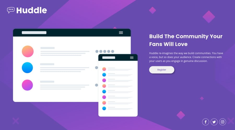
- I just added a couple of things to make the background image more responsive, and here's the code:
body {
    background-image: url('./images/bg-desktop.svg');
    background-color: hsl(257, 40%, 49%);
    background-repeat: no-repeat;
    background-size: cover;
    min-height: 100vh;
}
- Well, I don't want to disappoint you, but using
floatin modern web development is discouraged. Developers used it way back, when there was noflexboxandgridto make some layouts. But building a responsive website withfloats is a real pain. It's cool that you not only put the layout together, but also managed to make it responsive. However, at the end of the day, I'd still suggest practicing new technologies more, such asflexboxandgrid.
I hope this was helpful 👨🏻💻 Congrats on finishing the last project, there are many more cool projects coming, I'm pretty sure you're going to make them as good as these. Cheers 👾
Marked as helpful
1
@fvaldes0109
Posted
@kens-visuals Hi, thanks for the advice!
I ended up using float because when I tried flexbox, the image only shrank on it x-axis, messing up with its aspect ratio. I already replaced it with flexbox and fixed the issue. Seems like I only needed to wrap the img inside a div XD.
0
@fvaldes0109 I'm glad that you figured it out 😅
0
