Responsive price grid component built with html css flexbox

Solution retrospective
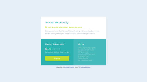
Hello - I'd like feedback on how i could better vertically center the "per month" copy next to "$29" under "Monthly Subscription"? How have others written the html markup? I used a paragraph tag to contain that sentence but maybe i should use another tag instead Feedback is welcome Thanks
Please log in to post a comment
Log in with GitHubCommunity feedback
- @vanzasetia
Hi, Andrew! 👋
Congratulations on finishing your first Frontend Mentor challenge! 🎉 It's great that you made the site responsive using the mobile-first approach! Good job! 👍
Regarding your question, when I did the challenge I wrapped the $29 on its own
span. So, if you want to follow my approach then I recommend wrapping the $29 text with aspanand the make thepelement as the flex container to align the per month text center vertically.<p class="subscription__price"> <span class="subscription__number">$29</span> <span class="subscription__month">per month</span> </p>You've used the correct HTML markup by using a paragraph tag as the main element to wrap those text. The text only makes sense if those are read together (or as one paragraph) by screen readers. So, you are on the right track. 👍
One thing that is worth fixing is the background color for the Sign up link on the hover state. I believe it should be a lighter color than the original state. The black color is not match the color scheme of the page (at least in my opinion).
That's it! I hope this information is useful! 😁
Marked as helpful - @denielden
Hi Andrew, great work on this challenge! 😉
Here are a few tips for improve your code:
- add
maintag and wrap the card for improve the Accessibility - to smooth also the bottom angle add
overflow: hiddentocontainerclass - remove all
marginfromcontainerclass and body - use flexbox to the body to center the card. Read here -> best flex guide
- after, add
min-height: 100vhto body because Flexbox aligns child items to the size of the parent container - add
transitionon the element with hover effect - instead of using
pxuse relative units of measurement likerem-> read here
Overall you did well 😁 Hope this help!
- add
- @gwtpraveen
hi Andrew Saganda, good job completing this challenge
in terms of accessibility issues simply wrap all content between main tag and you should have one level one heading h1 tag
keep up the good work...!
- @shashreesamuel
Hey good job completing this challenge
Keep up the good work
Your solution looks great however I think that the card needs a bit of margin from the top using
margin-top.I hope this helps
Cheers
Happy coding 👍
- @besttlookk
hi, Any time you need to center, you can use flexbox. Like to make your content center w.r.t screen, you can do this:
body{
  display:flex;
  justify-content:center;
  aligned-items:center;
  min-height: 100vh;
}
Good luck
Happy Coding


Join our Discord community
Join thousands of Frontend Mentor community members taking the challenges, sharing resources, helping each other, and chatting about all things front-end!
Join our Discord