


@mattstuddert
Posted
Nice work on this challenge, Folarin! Your Sass code looks good! As you build larger projects, you'll undoubtedly start to break your .scss files into sub-directories. I'd recommend looking into the 7:1 pattern which works well for Sass projects.
Beyond your Sass code, which looks fine. I'd recommend trying to use min-width media queries instead of max-width. It's quite a common workflow with front-end developers to use them and work mobile-first. It can often lead to less CSS code and has the benefit of loading in fewer styles for mobile users, which can be a nice performance gain.
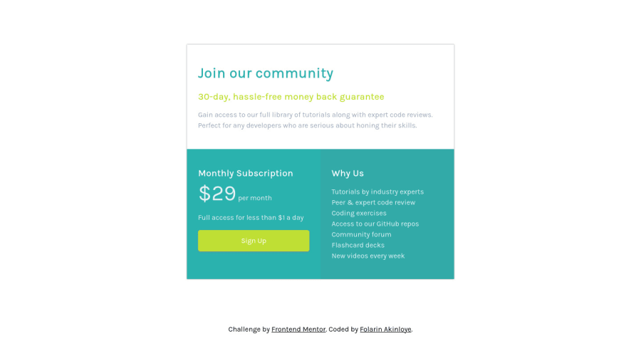
I'd also recommend going through one more round of refinements to get your solution matching up to the design. You can see in the design comparison that there are some differences at the moment. Accuracy is a key part of being a front-end developer, so it's a skill that's well worth taking some time to build.
I hope that helps. Keep up the great work! 👍
@folathecoder
Posted
@mattstuddert Wow! Thank you for the feedback. I really appreciate you Matt!
Is there a way I can get in touch with you through slack?
I really need guidance throughout my journey!
@mattstuddert
Posted
@folathecoder no problem! Yeah, please feel free to message me in Slack. Although if recommend using the public #help channel for most questions. That way, others can give their thoughts as well. I'll always answer questions too wherever I can.
