


@ApplePieGiraffe
Posted
Hey there, Guliye! 👋
It's great to see you completing so many challenges! 😃 Well done once again! 👍 Your solution looks good and responds well! 🙌
I'd like to suggest,
- Adding a
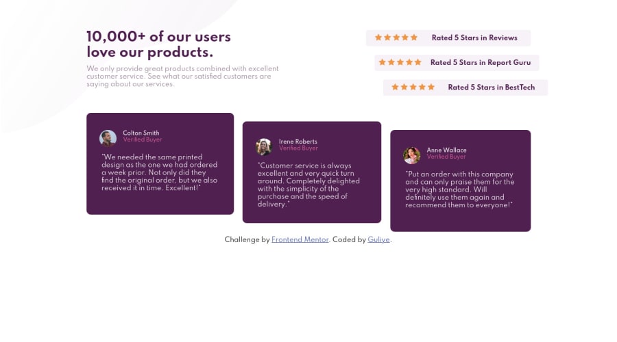
max-widthto the main container or wrapper to prevent the content of the page from becoming too stretched on extra-large screens. - Adding the bottom-right background image from the original design to the solution (it doesn't seem to be there, at the moment).
Keep coding (and happy coding, too)! 😁
@guliye91
Posted
@ApplePieGiraffe Thanks for the feedback. I appreciate. i wanted to add the bottom-right background image using the pseudo ::after but i failed to produce the exact matching of the design. so i just said leave it. any suggestion on how i can add to that image??
@ApplePieGiraffe
Posted
@guliye91
I suggest using CSS background images to add and position the background shapes in this challenge. That'll keep them out of your HTML and make your markup cleaner, and I think they're a little easier to style without getting in the way of other elements on the page this way. As long as the body as always at least as tall as the viewport (which you can make sure of by adding min-height: 100vh to the body), you can set the background-position property of that background image to bottom right, and it should always stick to the bottom-right corner of the screen. Here's a nice article from MDN web docs that helped me learn all about borders, backgrounds, and background images that you may find helpful. Good luck and have fun! 👍
Oh, and hey, if you find these comments helpful, an upvote would be appreciated! ;)
