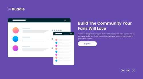
Submitted 8 months agoA solution to the Huddle landing page with a single introductory section challenge
Ressponsive Huddle Single Section Using Flex Box

@qayoommunawar
Solution retrospective
What are you most proud of, and what would you do differently next time?
I designed the project, yet somewhat feeling sorry as can't design the way i thought i would do. I was trying to use fluid style which was not achievable at the end.
What challenges did you encounter, and how did you overcome them?The main challange in such projects are font-size etc. tried to use clamp, end up using media queries instead.
What specific areas of your project would you like help with?what would be the best approach to attain best responsiveness in this case ? i used flexbox can it be done better even with flexbox or grid ??? how can i use clamp for heading font-size so that it changes its size as per vw???
Code
Loading...
Please log in to post a comment
Log in with GitHubCommunity feedback
No feedback yet. Be the first to give feedback on Ahmed Ali's solution.
Join our Discord community
Join thousands of Frontend Mentor community members taking the challenges, sharing resources, helping each other, and chatting about all things front-end!
Join our Discord