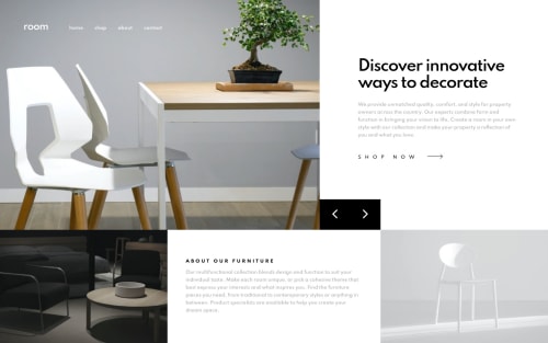
Room - Sass, intersection observer API, mobile first, Flex, Grid

Solution retrospective
Hello👋!
I have to admit that the challenge was more difficult than I thought but it was fun to get throught the problems I faced. Here are few new things that i was able to bring in into my project:
:focus-visiblepseudo class (spec). This selector should now only indicate focus when it is helpful to the user - such as in cases where the user interacts with the page via a keyboard or some other non-pointing device.- This is first time i used @extend rule. Since my modifier classes
kv__hero-bg--1/2/3all uses styles fromkv__hero-bg. I extend this class and it allowed me to remove unnecessary class from HTML code. - Added sticky nav menu using Intersection Observer API. This time i make it to be just hamburger menu after scroll with background, not sure if it's pretty but i want to have some fun.
- Added backdrop-filter to opacity background when nav mobile is open. It provide effect such as blurring. (no Firefox support yet tho). Thanks to @ApplePieGiraffe. I found it in his solution.
- I experimented with
clip-pathto create this slide effect on my background slider. - Added
aria-live="polite"to my.kv__introelement to expose dynamic content changes in a way that can be announced by assistive technologies after my slider change content within that element. This one is from @Matt. - Implement
prefers-reduced-motionCSS media feature which is used to detect if the user has requested that the system minimize the amount of non-essential motion it uses. Prevent animations in brief.
Again thanks for @grace-snow for helping me. No specific questions here but any additional feedback will be appreciated!
Thanks! 😁
Please log in to post a comment
Log in with GitHubCommunity feedback
- @grace-snow
This is hands down the best version of this solution I've seen. Ace work!
bookmarking
- @ApplePieGiraffe
Hey, tediko! 👋
Amazing work on this challenge! 🤩 It sounds like you learned a lot in the making of this solution and it sure was worth it! 😀 Everything's on point! 👌And the animation on the mobile menu icon and the slider is pretty fun! 👏
I'm looking forward to seeing more great solutions from you! 🙂
And, of course—keep coding (and happy coding, too)! 😁
- @mathcrln
Such amazing work, well done!
The UI implementation is amazing and smooth, and I actually learned quite a few things reading your code (like the @extend rule I hadn't heard about yet, amongst other things), so thank you for that!
Please keep up the great work 💪🏾
- @greatmetis
WOW! tediko,
Your solution is AMAZING. I tried not to type fewer capital words, BUT I just realised how small I am, and really inspired by your work.
This one is definitely THE BEST solution I've seen here so far. I don't have any suggestions to you while I believe you should know you deserve more compliments.
BTW, thanks for writing the notes clearly. I just learnt a handy effect from you,
backdrop-filter:blur(), and I have used it in my solution 🔆Again, thanks for your inspired work!
- @brasspetals
Hey, tediko!
Was a bit busy yesterday, so didn't get a chance to comment (but bookmarked!). Sadly, I don't have anything constructive to say, so I'll chime in with everyone else in saying that your solution is EXCELLENT. 🙌 It responds great, the UX is great, keyboard accessibility is great...are you sensing a pattern here? 😄
My only real suggestion is to maybe expand on your README, adding something like what you wrote here: a bit more about your process, what you learned, resources you found helpful, etc.
Again, awesome job and looking forward to your next solution!
- @Junjiequan
Hello, tediko,
I really like the image slider animations and the idea of mobile menu icons.
But, there's one issue I believe should be avoided for this challenge. That is , however the screen resizes, the edge of the right button should always exactly in touch with right bottom corner image.
My screen has resolution of 1920x 1080 and from my screen there's huge gap between right button and bottom right image. In my case, the gap disappears only when I resizes the page to 1440px not below nor above.
Since this challenge is mainly for practicing optimal layout, I think it is worth to notice to make design matches different screen size.
I also did this challenge before, and my solution was to calculate exact percentage of width for each layout with
width:calc( )method.Hope you don't feel offended receiving suggetions from a newbie.


Join our Discord community
Join thousands of Frontend Mentor community members taking the challenges, sharing resources, helping each other, and chatting about all things front-end!
Join our Discord