sass. parcel, netlify

Solution retrospective
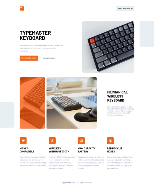
This is my first projects. Comments & corrections will be appreciated.
Please log in to post a comment
Log in with GitHubCommunity feedback
- @MojtabaMosavi
There are some minor things:
1- I see that you're using bem, it really beneficial to be consistant with it, it would be a great practice for the next challange that you do, try to implement everthing with bem becuase it's reap the many great reward of it.
2- The button in the header and text beside it need some need some margin-right (going for mobile view to desktop).
3- Always when you write markup, firstly see if there is a hmlt tag specific for that task, for instance the div with the class main could be substituted with a main tag.
Keep coding :=)
Marked as helpful - P@palgramming
🌟🌟🌟🌟 Looks great big... small... and all the sized in between. Great Job!!
Marked as helpful
Join our Discord community
Join thousands of Frontend Mentor community members taking the challenges, sharing resources, helping each other, and chatting about all things front-end!
Join our Discord