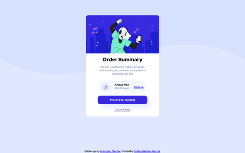
Not Found
Not Found
Not Found
Not Found
Not Found
Not Found
Not Found
Not Found
Not Found
Not Found
Not Found
Not Found
Not Found
Not Found
Not Found
Not Found
Not Found
Not Found
Not Found
Not Found

Submitted

Second Try of this Page Super Responsive!

Andrea 240

@ponisworld

Desktop design screenshot for the Order summary component coding challenge

This is a solution for...

  • HTML
  • CSS
1newbie
View challenge

Design comparison


SolutionDesign

Solution retrospective


♥ Do you have any questions about best practices? ♥

I would be glad of receiving any kind of feedback!

Community feedback

Eray 1,410

@ErayBarslan

Posted

Hey Andrea, great work on your solution! Some suggestions:

  • Since you use background-size: cover; on both width and height it tries to cover entire page and leaving no space for background-color. You can assign 100% to it. Also you shouldn't limit body to 95vh, there is a better approach to center the content. With little refactor on body and html you can use:
html {
    height: 100%;
}

body {
    ...
    background-size: 100%;
    min-height:100%;
} /* you can keep rest but remove 95vh */
  • By the time screen width and height changes, card's height changes in a weird way. That's due to assigning height to elements. You shouldn't use height unless you really need to. You can simply remove every height property by just leaving the ones in html and body and your design will stop breaking. Always let the element's height be defined by it's children and margin, padding.
  • Image isn't centered and not responsive. Instead of using illustration-hero as background-image you can assign an <img> element since it's part of content effecting card's size rather than being just a background. It would make it easier to align rest of the card:
/* HTML */
<div id="heroImage">
  <img class="image" src="./assets/img/illustration-hero.svg" alt="dancing with music">
</div>
/* you can aswell use `aria-hidden:true` for screen readers to skip since it's for design */

/* CSS */
div#heroImage {
    width: 100%;
    border-radius: 14px 14px 0 0;
}

.image {
    display: block;
    width: 100%;
    border-radius: 14px 14px 0 0;
}
/* as an alternative to image border-radius, you can use overflow:hidden on div */

Feel free to test them out as they will make your page more responsive while respecting the design. If you need to make further adjustments just change margin, padding values. Great work again and happy coding :)

Marked as helpful

1

Andrea 240

@ponisworld

Posted

@ErayBarslan Wow, thank you so much! That fails you told me are like tricks I learned to do but I wasn’t sure about and your answers really have a lot more sense! I’ll try to re-do it with your tips and look if it fits well!

Thank you so much for the feedback, was really really helpful. If you don’t mind I’ll use that tips since now!

1
Eray 1,410

@ErayBarslan

Posted

@ponisworld Sure thing go ahead and use, I'd be glad if they help you :) If you got any question feel free to shoot.

1

Please log in to post a comment

Log in with GitHub
Discord logo

Join our Discord community

Join thousands of Frontend Mentor community members taking the challenges, sharing resources, helping each other, and chatting about all things front-end!

Join our Discord