


@mattstuddert
Posted
Great work again, Senatrius! Your solution looks really good and scales down well to mobile. Here are a few pointers after looking at your code:
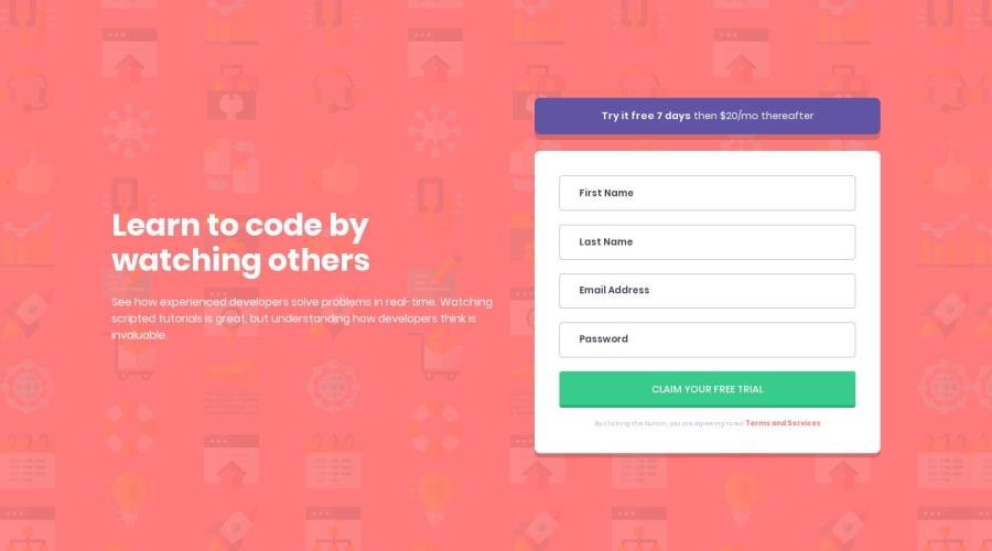
- You've added labels for the inputs, which is great. But you're currently setting the
.accessibility-requirementclass todisplay: none;which will actually remove that content for screen reader users, which is who you want that content to be accessible for. I'd recommend reading this article on WebAIM about screen reader only content to learn some other approaches. Also, the content inside each of thelabelelements literally says "Label", whereas this should be the labeling text for theinputit is associated with. So, if it's alabelfor the first name field, the content should be "First Name". - Your JS looks good and you've structured it well. The one thing it's not doing at the moment is removing the errors once a valid input has been provided.
- I've noticed that you're using
max-widthmedia queries on all of your projects. Have you ever tried usingmin-widthmedia queries instead ofmax-width? It's quite a common workflow with front-end developers to use them and work mobile-first. It can often lead to less CSS code and has the benefit of loading in fewer styles for mobile users, which can be a nice performance gain. I'd recommend giving it a go on a future project!
I hope this feedback helps. Keep up the great work! 👍
@Senatrius
Posted
@mattstuddert Ah yes, that label thing was more of a work around than anything else :) There doesn't seem to be a label in the design preview but leaving the labels out would give me HTML validation errors, so since I couldn't think of anything else I just decided to add the labels and then make them invisible. It's definitely a super janky and probably breaks all kinds of guidelines, but it (sorta) did the job.
I'll definitely be looking into that one in future projects. Only recently learned of a blur event listener which should work decently well in cases like this.
Have heard of them, never used them since I didn't think it made a huge difference. But you bring up a good point, it would load less code at the start on mobile devices and I'm sure PCs could handle a few extra lines :)
Thank you for all of the advice. Will be definitely taking these to heart :)
@mattstuddert
Posted
@Senatrius you're welcome! Yeah, I would definitely try practicing building accessible websites while doing these challenges. It's such a big part of being a front-end developer and is often neglected.
