Not Found
Not Found
Not Found
Not Found
Not Found
Not Found
Not Found
Not Found
Not Found
Not Found
Not Found
Not Found
Not Found
Not Found
Not Found
Not Found
Not Found
Not Found
Not Found
Not Found

Submitted

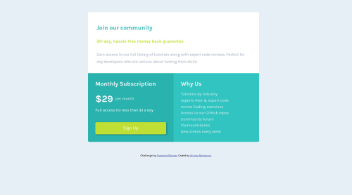
Single grid component

@Jorahhh

Desktop design screenshot for the Single price grid component coding challenge

This is a solution for...

  • HTML
  • CSS
1newbie
View challenge

Design comparison


SolutionDesign

Solution retrospective


Used Grid for this challenge for the first time.

Really though for me, and a I don't even know if it's a good code or if I could do It better. Any advice on how do it better would be appreciated.

Community feedback

@arfarobs

Posted

Hey, Angelo. Great job on learning the basics of CSS Grid. I have a few suggestions for you, mate.

  1. If I was to do this project, I would put the line "join our community" as an <h1> heading. This will avoid the accessibility error in the report.

  2. To fix the issue with the media query, you can change line 126 from this: @media (max-width: 1600px) and (min-width: 800px){ to this: @media (min-width: 800px){ By doing this you are saying that you want your media query to work on all screen sizes with a width of 800px+.

Marked as helpful

0

@Jorahhh

Posted

  • Can I use <h1> heading and then resize it as I want, or could it be seen as error? This is still unclear to me.

  • oh thanks! Finally. This is really helpful. What should be the minimum screen size for a desktop?

Thanks a lot, Arthur!

1

@arfarobs

Posted

@Jorahhh No problem.

  • Yes you can use an <h1> and then style it however you like. The reason it often looks bigger is because different browsers have default styling settings. So if you don't style your <h1> the web browser will automatically make it larger. They do this because <h1> is generally classed as the most important heading. <h6> being the least important. I'd suggest researching "resetCSS" and "normalize CSS". There are lots of ways that you can stop browsers from implementing default styles. ResetCSS and normalize CSS are two of the more common ways.

  • The minimum size for a desktop would really depend on the desktop. All computers will have different size screens. I personally think that one of the best ways to decide on what screen sizes to use in your media queries, is to view the website in chrome dev tools, then play around with the size. If there is a certain size where your website starts to break or to look bad then you can add a media query for that size.

  • But generally you can expect the average phone to be around 375px. The average tablet to be around 768px and the average desktop to be 1440px.

Marked as helpful

0

@Jorahhh

Posted

Ah! I think I did some mistakes in the @media queries with screen side dimensions.

I put wrong min-max widths, 'cause from my pc (MacBook Air so its 1280px x 800px, I guess) it seems fine, but from others pc's not.

Basically, on a bigger screen I see what I should see on a mobile device.

Any suggestion on this?

0

Please log in to post a comment

Log in with GitHub
Discord logo

Join our Discord community

Join thousands of Frontend Mentor community members taking the challenges, sharing resources, helping each other, and chatting about all things front-end!

Join our Discord