Submitted 5 months agoA solution to the Single price grid component challenge
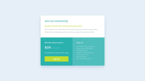
Single price grid component

@AsmaaYaareb
Solution retrospective
What specific areas of your project would you like help with?
Any feedback is appreciated.
Code
Couldn’t fetch repository
Please log in to post a comment
Log in with GitHubCommunity feedback
- @horoserp
Looks awesome!
If you want to make the box-shadow on the sign-up button look even better, increase your blur-effect and add a spread-radius.
Keep it up!
Marked as helpful - @MahmoudAdel1112
You did an amazing job on this challenge! 🚀 It's clear that you put in a lot of effort and skill. This is a fantastic achievement, and you should be really proud!
Just a small suggestion: the Sign Up button would feel even better with a darker color variant on hover to enhance the user experience.
Never stop pushing yourself. This is just the beginning of something great! 💪
Marked as helpful


Join our Discord community
Join thousands of Frontend Mentor community members taking the challenges, sharing resources, helping each other, and chatting about all things front-end!
Join our Discord