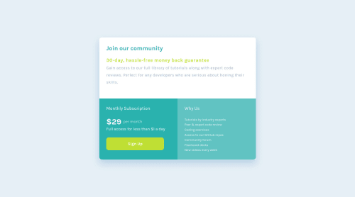
Not Found
Not Found
Not Found
Not Found
Not Found
Not Found
Not Found
Not Found
Not Found
Not Found
Not Found
Not Found
Not Found
Not Found
Not Found
Not Found
Not Found
Not Found
Not Found
Not Found

Submitted

Single price grid component // Mobile First, Grid

P
Katrien Sā€¢ 1,070

@graficdoctor

Desktop design screenshot for the Single price grid component coding challenge

This is a solution for...

  • HTML
  • CSS
1newbie
View challenge

Design comparison


SolutionDesign

Solution retrospective


Maybe I could change the positioning of the $29. Hadn't been coding for a week, so feel proud I made this, without too many issues.

Community feedback

Roman Filenkoā€¢ 3,335

@rfilenko

Posted

Hi Katrien, the simplest solution - put those 2 elements into one container, and make it flex {display: flex; align-items: center;}. Adjust other needed css properties (margin, padding) for child elements as well.

Cheers, Roman

2

P
Katrien Sā€¢ 1,070

@graficdoctor

Posted

@rfilenko Yeah, that did the trick. Thank you.

0
Svenā€¢ 295

@Sven72

Posted

Hi Katrien, I solved the $29 with placing "$29 per month" into a div giving both "$29" and "per month" a p tag with a unique class. (Maybe an ID would be better?) `<div class="flex-container__row"> <p class="dollar">$29</p> <p class="month">per month</p>

</div>`

Than I applied in CSS display: flex to the div. So the pelements are aligned by default in a row.

To center the month class vertically I need the align property from flex. So I have in my CSS:

.month { align-self: center; color: var(--light-gray); padding-right: 90px; } Hope, this makes sense. Best, Sven

1

P
Katrien Sā€¢ 1,070

@graficdoctor

Posted

@Sven72 Great tip! Thanks.

0
P
Robert McGovernā€¢ 1,095

@tarasis

Posted

šŸ‘‹ Katrien

Congrats! Desktop is close šŸ‘

Don't forget the border-radius.

Regarding the mobile version, it currently fills up the whole screen and doesn't look like a component (or the mobile design).

I'd suggest in wrapper set width: 90%; and the margin: auto; and remove height: 100vh; from container and add the following to body

    height: 100vh;
    margin: auto;
    display: flex;
    flex-direction: column;

Keep up the great work

šŸ––

0

P
Katrien Sā€¢ 1,070

@graficdoctor

Posted

@tarasis Added the border-radius and made the mobile version a component with your input. Thank you :)

0

Please log in to post a comment

Log in with GitHub
Discord logo

Join our Discord community

Join thousands of Frontend Mentor community members taking the challenges, sharing resources, helping each other, and chatting about all things front-end!

Join our Discord