


P
Emmilie Estabillo• 5,540
@emestabillo
Posted
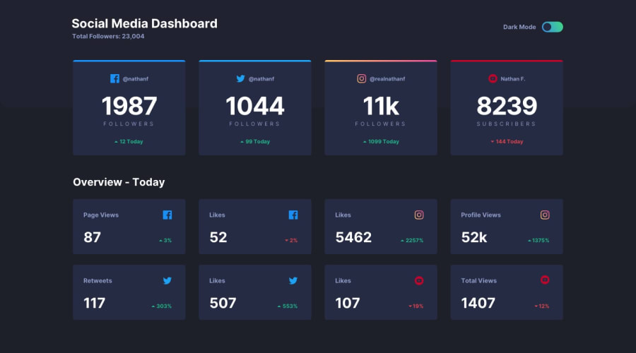
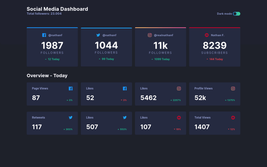
Hi Lucas, looks good. Toggle works well, but better for accessibility if it can be tabbed and focused on by someone who is using keyboard only. Here's a great article on toggle buttons if you want to look into it. Another curious thing is that the twitter card on the first row is a tad smaller than the other three. I think it's because of the size of the twitter icon. Lastly, I think the 700px breakpoint for the top row seems a little tight, maybe arrange them in pairs or increase the breakpoint. Hope this helps!
1
Lucas Pedro• 640
@Lusk1nha
Posted
This helps me a lot, thanks. 😃
1
