Not Found
Not Found
Not Found
Not Found
Not Found
Not Found
Not Found
Not Found
Not Found
Not Found
Not Found
Not Found
Not Found
Not Found
Not Found
Not Found
Not Found
Not Found
Not Found
Not Found

Submitted

Space Tourism

#gsap
P
Chamu• 12,970

@ChamuMutezva

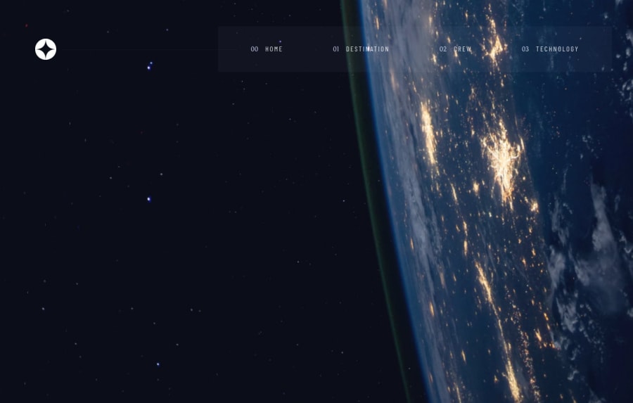
Desktop design screenshot for the Space tourism multi-page website coding challenge

This is a solution for...

  • HTML
  • CSS
  • JS
3intermediate
View challenge

Design comparison


SolutionDesign

Community feedback

Nicolas Fanti• 110

@Nico-2b

Posted

Hi! I really like the animations you put on your site. If I may say so, I noticed that in mobile mode on the navigation bar the line under the categories touches the categories below.

Moreover on a mobile phone you can scroll horizontally when the navigation bar is closed, to avoid this you must add a position:relative on your body in addition to overflowx:hidden.

body {
    border-color: transparent;
    min-height: 100vh;
    text-rendering: optimizeSpeed;
    line-height: 1.5;
    font-family: var(--ff-bellefair);
    font-weight: 400;
    overflow-x: hidden;
    position: relative;
}

I hope i helped you! Bye

Marked as helpful

0

P
Chamu• 12,970

@ChamuMutezva

Posted

@Nico-2b , thanks for the feedback. That was really helpful

0

Please log in to post a comment

Log in with GitHub
Discord logo

Join our Discord community

Join thousands of Frontend Mentor community members taking the challenges, sharing resources, helping each other, and chatting about all things front-end!

Join our Discord