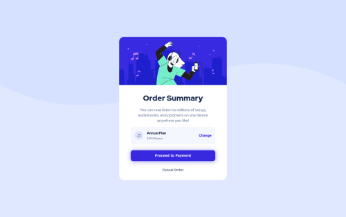
Still learning how to use css properly

Solution retrospective
I didn't really know what you meant by '- Mobile: 375px - Desktop: 1440px' , so I just made it center in the middle of the body. Feedback about that would really helpful.
Please log in to post a comment
Log in with GitHubCommunity feedback
- @Tiasstiass
Good job! 👏
Nice work overall, some feedbacks:
- You can use
overflow: hiddenfor the card’s border-radius to work without setting it on the image as well, - The box shadow is really big on the button, a subtle
0 2px 5px #00000033should work, - You can apply that shadow on the card as well,
- Use more em and rem, especially rem for font-sizes. If you set a font-size on body and then rem on children, you could change all your font-sizes by just changing the body font-size and the children will scale accordingly.
Keep up the good work 💪
- You can use
- @FluffyKas
Hey, it means that the design screenshots that you got to work with were taken with those screen widths ^^ By the way great looking solution!
Join our Discord community
Join thousands of Frontend Mentor community members taking the challenges, sharing resources, helping each other, and chatting about all things front-end!
Join our Discord