Not Found
Not Found
Not Found
Not Found
Not Found
Not Found
Not Found
Not Found
Not Found
Not Found
Not Found
Not Found
Not Found
Not Found
Not Found
Not Found
Not Found
Not Found
Not Found
Not Found

Submitted

Testimonials grid section

Kevin Canlasā€¢ 225

@kvncnls

Desktop design screenshot for the Testimonials grid section coding challenge

This is a solution for...

  • HTML
  • CSS
2junior
View challenge

Design comparison


SolutionDesign

Solution retrospective


The JPG version and the Figma version of this design are different. The comparison section on this challenge shows the free JPG version, so if you used the Figma design, you're not going to match the slider comparison.

The "Daniel Clifford" card from the Mobile (the free JPG) version has some irregularities in its design compared to the other cards. I thought I was going crazy, so I threw the JPG into Figma to do some manual measurements, and here's what I found:

The bold text is misaligned, causing the "mid-course" misalignment in the JPG. The large paragraph in the purple section has a 48px padding to its right, while the other cards all have 32px.

I ended up using one of my credits to download the Figma version and lo-and-behold, I was right! I also found some discrepancies between the JPG and Figma designs.

That being said, my design is based on the Figma file since it has less discrepancies compared to the free JPG version.

Let me know what you guys and gals think!

Community feedback

P
Emmilie Estabilloā€¢ 5,540

@emestabillo

Posted

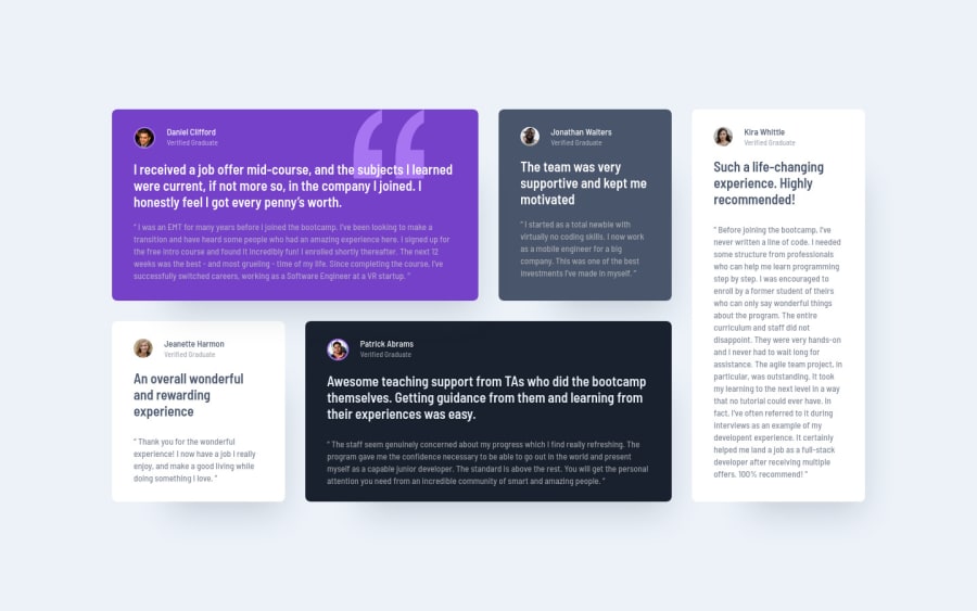
Hey Kevin, great stuff here. Desktop version as seen on the screenshot looks solid. For medium and smaller widths though, the component looks off-center because it is following the declaration of the grid columns with minmax(255px, 327px). I would probably try using:

  1. max-width for the main .grid container to make it fluid, and

  2. maybe fractional units for the columns instead of hard coded values so that the grid is not waiting for the next 255/327px of space to create another column and thus, not render that huge empty space on the right while in the process of "waiting".

As for 1:1, I'm also a fan of it. Responsiveness beats it hands down though (my opinion). Here's a great article that was shared on the Slack channel recently that might be relevant. As you've probably guessed by now, the jpg version is taken from the original Sketch file :-)

2

Kevin Canlasā€¢ 225

@kvncnls

Posted

Thank you so much!! I still find it difficult to develop the parts between the designed mobile and desktop versions. Everything in between is almost like guess-work to me haha. I'll fix this up ASAP!

1
P
ApplePieGiraffeā€¢ 30,545

@ApplePieGiraffe

Posted

Hey, Kevin Canlas! šŸ‘‹

Nice job on this challenge! šŸ‘

Just wanted to say, after recently getting my hands on the Sketch/Figma design files, I also noticed there were some small discrepancies between them and the design JPGs. I thought I might be going crazy, too, but I guess that's simply how it is. I usually end doing a combination of both using the units and styles specified in the design files and eyeballing it from the JPGs if I really want my solution to match up in the design comparison. šŸ˜Š

As emestabillo mentioned, centering the grid in the tablet/mobile layouts would be a good idea and I think adding a little bit of space (using margin or padding) between the last testimonial card and the bottom of the screen would nice, too. šŸ˜‰

Keep coding (and happy coding, too)! šŸ˜

1

Kevin Canlasā€¢ 225

@kvncnls

Posted

@ApplePieGiraffe Thank you for the feedback!! I'm really enjoying Frontend Mentor so far, I'm glad the community here is active in giving great feedback. Thank you!

0

Please log in to post a comment

Log in with GitHub
Discord logo

Join our Discord community

Join thousands of Frontend Mentor community members taking the challenges, sharing resources, helping each other, and chatting about all things front-end!

Join our Discord