Not Found
Not Found
Not Found
Not Found
Not Found
Not Found
Not Found
Not Found
Not Found
Not Found
Not Found
Not Found
Not Found
Not Found
Not Found
Not Found
Not Found
Not Found
Not Found
Not Found

Submitted

this might be a MASTERPIECE (must see on mobile, tablet and laptop)

Daniel 250

@daniel-hennig

Desktop design screenshot for the Bookmark landing page coding challenge

This is a solution for...

  • HTML
  • CSS
  • JS
3intermediate
View challenge

Design comparison


SolutionDesign

Solution retrospective


  • SEMANTIC html5, css3/ scss, vanillaJS
  • customized svg images/ codes
  • smooth transitions on nav-menu, tab-menu/ slider and accordion (faq)
  • hamburger-menu animation (as always)
  • almost pixel perfect (I used the design images, not the desig files for PRO members, yet)
  • clean and efficient code

This challenge was a bit tricky though, because some of the provided images didn't have the blue background shapes as they have in the design images - so that I had to create the shapes by myself with Adobe XD (I edited svg images with XD the first time).

After all, I tried my best best and I highly appreciate any feedback/ suggestions. You can be as harsh as you like on me. What do you like the most? What can I improve? I want to go moon with my skills, so that I can help others better, too:)

Community feedback

Account Deleted

Hi,

Pretty good job on completing the challenge it actually good but there's somethings I need to point out;

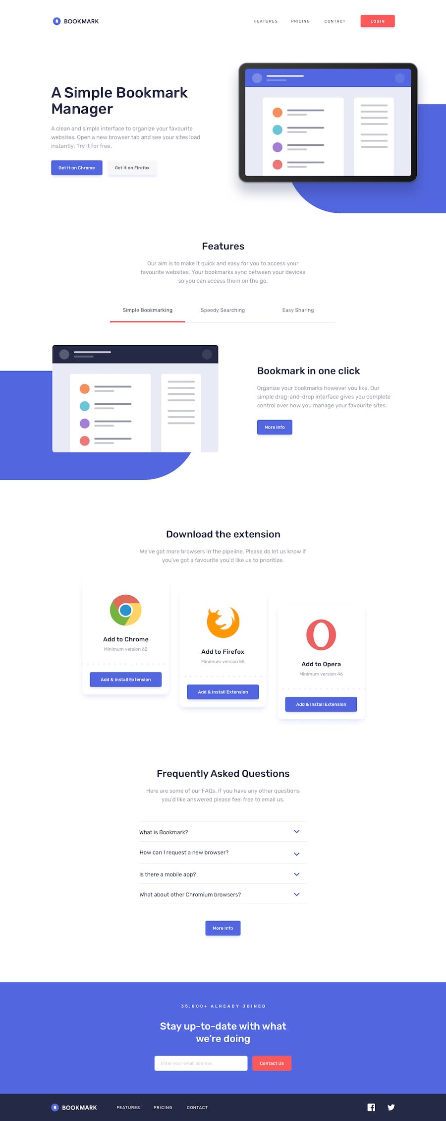
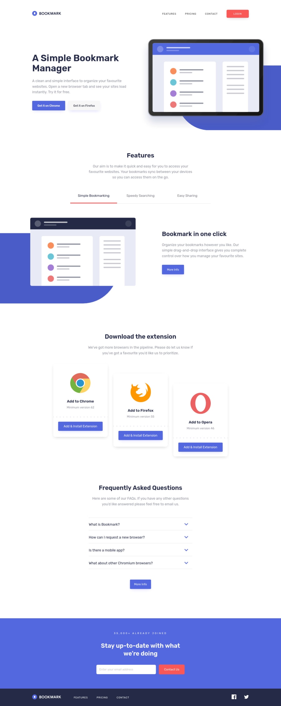
  • When you go into mobile and activate the mobile menu & then return to desktop while it's still active, it doesn't get dismissed but get carried over... The hamburger transition looks nice though.
  • You should also have a maximum width of 1440px on the whole site because when you go over that everything gets stretched out, and doesn't look good.
  • & the sliding animations on the features section are pretty nice, though I think the blue background should just stay there and let all the other stuff animate since it's just the same.

Keep coding👍.

Marked as helpful

1

Daniel 250

@daniel-hennig

Posted

@thulanigamtee Hi, thank you very much for your feedback, I'm happy that you point some things out! The nav issue might be a tough one, but I will fix that, of course. Regarding to the maximum width of 1440px: It was actually on purpose to stretch things out when the screen is getting bigger, so that I can use less media queries for that (more fluid responsiveness), but since you're saying it doesn't look good, I'll try to make it look better or using max-width of 1440px like you said:)

The idea with the fixed blue background is awesome, this I'll change as well!

Thank you again for your feedback, I'm going to work on all that today and let you know, once I'm done.

0
Daniel 250

@daniel-hennig

Posted

@thulanigamtee Hi again! :) Your first and last suggestion, which were very helpful, are now manifested into a new solution. I hope you like it!

Thank you, for your support, keep coding! :)

0
Amon 2,560

@A-amon

Posted

Hello! That was a great animation. The responsiveness is good too~ 😀

Here are few suggestions:

  • It seems like after toggling the hamburger button, and returning to larger size, the <nav> went nuts! 😅
  • That was great effort on customizing the svg 😁 but you could have used pseudo-elements - This is just a suggestion tho! Both works 😂.
  • I like the sliding tab animation! (😉 I will be studying your code later on that.) Maybe you can increase the height & width of the <a> tabs so that the click area is larger and not restricted to the text.
  • I think you can remove the 'logo icon' from the alt text of images such as 'facebook logo icon'. This could be just my opinion but I think just 'Facebook' would make more sense to screen reader users than the initial. 😀 Resource

Marked as helpful

1

Daniel 250

@daniel-hennig

Posted

@A-amon thank you, I truly appreciate your feedback! The <nav> issue might be a tough one, very good point! Using the svg as pseudo-elements is a great idea, maybe I can combine your suggestion with the idea of @Teegamtee (commented below your comment), so that the background is fixed as ::before or ::after and the svg moves along. Regarding to the social images.. yes you're right, since it is for screen readers rather than bots (seo), it makes more sense to just shorten it like you said.

Oh, and I am happy that my sliding tab animation inspires you to study the code behind it. If you've any question on that, please let me know:)

Having that said, I'm going to fix all these issues today and reply to you again once I'm finish.

0
Amon 2,560

@A-amon

Posted

@daniel-hennig Awesome! I will 😉

0
Daniel 250

@daniel-hennig

Posted

@A-amon hi Amon, just as promised, my new solution is uploaded.

The "logo icon" alt texts are gone now, I've fixed the issues with the nav and I used your suggestion with the pseudo-elements. Hopefully the slider animation inspires you even more now! :D

Regarding to the <a> element.. I've experienced with increasing the height, width and padding, but as soon as I do this, the red active-line will adopt to the width and not on the word itself anymore, which is an issue. If you have any ideas to increase the width and height without hurting the red line, please let me know :)

0
Amon 2,560

@A-amon

Posted

@daniel-hennig Wow, your positioning is really on spot! 😲

Not quite sure what that means but let's see if this works 😂:

main .features-section .tab-slider ul li

/*To remove padding on tab list*/
padding:0;

main .features-section .tab-slider ul li a

/*Set `<a>` to have the size of the tab*/
display:flex;
align-items:center;
justify-content:center;
padding:20px 0 31px;

main .features-section .tab-slider ul li a.active::after

/*Change `botttom:31px;` to `bottom:0;`*/
bottom:0;

Marked as helpful

1
Daniel 250

@daniel-hennig

Posted

@A-amon hi Amon, thank you! Yes, this just works, I had the same idea, the issue with that still occurs when it comes to mobile screen, though. On medium and large screen the .active::after red-line always has the same width as the <a> (padding included) when you click on the different tabs, which is good (because it's like that in the design, too). But when you apply the same method to the mobile screen and experience a little with that, then the .active::after red-line has still the same width (when you click through again), which is not what I want, because (for mobile) the line should only take 85% width of the word (<a>) itself, but not of the word and the padding together (you can see the difference in the design). You know what I mean?

Nevertheless, I am happy it works for medium and beyond (it's already uploaded as well). In order to make it work for mobile, I've even tried to use JavaScript DOM manipulation, but I couldn't find a way to go. Actually it's not a big issue, in my opinion, but I always appreciate perfection :D

0
Amon 2,560

@A-amon

Posted

@daniel-hennig This has become like a debugging session 😂 in a chat. Ah, I didn't notice that issue! Then we might have to make some tweaks here:

  • .tab-slider
/*Set same horizontal spacing as .features-desc*/
padding:0 2.5em;
  • .tab-list
/* For small screen devices (< tablet size) */
display: flex;
flex-direction: column; /*Stack tabs*/
align-items: center;      /*Vertically aligned*/
  • main .features-section .tab-slider ul li
width:100%;
  • main .features-section .tab-slider ul li:first-of-type::before, main .features-section .tab-slider ul li::after
width:100%;
/*Remove max-width*/
  • main .features-section .tab-slider ul li a
display:block;
/*Remove flex-related properties*/

I might have left some by mistake (hopefully not) but I think these should do it! 🤔

1
Daniel 250

@daniel-hennig

Posted

@A-amon yeah it has really become a debugging session🤣 it's a genius approach you have there, but unfortunately the red-line still doesn't have 85% width of the <a> itself, but of the whole block then. If you toggle (in the browser dev tool) display: block; of <a> off, then you see, what I actually want, but as soon as we do that, we no longer have the whole tab clickable, but only the word (which we try to solve during our debugging session). The issue occurs as soon as we put padding, display: block or width of 100% to the <a>, because this guy (main .features-section .tab-slider ul li a.active::after) is dependend on his <a>. I've also tried to find a solution with JavaScript DOM manipulation (copying the width of <a> and then pasting the value to the width of the red-line), but even then it's the same result.

0
Amon 2,560

@A-amon

Posted

@daniel-hennig I'm leaving it as it is. Else, this might just become the longest comment section 😂. But personally, I think the answer should be hidden somewhere in the CSS. 🤔 Good luck on solving it~ 😂

1

@JSaporski

Posted

Congrats on your solution, it really looks awesome how smooth your page is when you go to responsive :D

1

Daniel 250

@daniel-hennig

Posted

@JSaporski Hi João Guilherme, thank you for your comment, I am happy that you like my solution! There's still some things to fix, but I am going to update these today, so that this solution gets even better soon :)

1
Daniel 250

@daniel-hennig

Posted

@JSaporski hi Hi João Guilherme, it's me again. I just want you to know, that my solution is updated now. Hopefully you can get something from my solution/code :)

1

Please log in to post a comment

Log in with GitHub
Discord logo

Join our Discord community

Join thousands of Frontend Mentor community members taking the challenges, sharing resources, helping each other, and chatting about all things front-end!

Join our Discord