Skip to content
  • Unlock Pro
  • Log in with GitHub
Profile
OverviewSolutions
24
Comments
130

Amon

@A-amon2,560 points

Do check out my projects here~ Github: https://github.com/A-amon

Latest solutions

  • Time tracking dashboard - HTML, SCSS, JS


    Amon•2,560
    Submitted almost 4 years ago

    3 comments
  • Sunnyside Landing Page (HTML, SCSS, JS)


    Amon•2,560
    Submitted almost 4 years ago

    2 comments
  • Social Media Dashboard using HTML, SCSS, JS


    Amon•2,560
    Submitted almost 4 years ago

    1 comment
  • Testimonials Grid Section - HTML, SCSS


    Amon•2,560
    Submitted almost 4 years ago

    2 comments
  • Article Preview Component with JS


    Amon•2,560
    Submitted almost 4 years ago

    0 comments
  • HTML, SCSS


    Amon•2,560
    Submitted almost 4 years ago

    1 comment
View more solutions

Latest comments

  • nathan•75
    @nathanaelsanilo
    Submitted over 3 years ago

    Insure Landing Page Using TailwindCSS

    #tailwind-css
    1
    Amon•2,560
    @A-amon
    Posted over 3 years ago

    Hello! That's a job well done~ 😀

    I hope these suggestions will be helpful:

    • I noticed that your intro image doesn't have a full width at sizes 375 - 768px. 👀
    • You can using before/after pseudo-selectors for overlaying the image for intro section. Reference
    • If I understood your other problem correctly, applying the background image to the div with .more class should fix it.
    Marked as helpful
  • Nnenna Miriam Udefi•300
    @Nnenna-udefi
    Submitted over 3 years ago

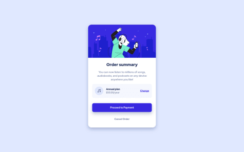
    summary-card_component

    #accessibility
    3
    Amon•2,560
    @A-amon
    Posted over 3 years ago

    Hello! Awesome work on this~ 😀

    Here are some tiny suggestions:

    • You don't need <br> tags for the paragraph. Let the words wrap naturally.
    • To ensure the card is in the center horizontally on large devices, unset width for <body>. Then, set background-size:100%; so that the background image fills up the remaining space.
  • Rishabh Kumar•30
    @Rishabh-2001
    Submitted over 3 years ago

    HTML5, CSS3, flexbox properties

    #accessibility
    1
    Amon•2,560
    @A-amon
    Posted over 3 years ago

    Hello! Good job on this challenge~ 😀

    Here are few suggestions:

    • To make the background color fills the entire height, set the height of .inner-container to 100vh.
    • The eye icon should have been provided in the challenge's folder. Anyway, to change the icon's color to white, you can use the SVG code directly and set fill:white; You can refer to this. Note: You can get the SVG code by opening the SVG file inside your text editor (E.g. VsCode).
    • I can't find your h1 element. 😂 You can read this to find out more about headings.
    Marked as helpful
  • maym42•380
    @maym42
    Submitted over 3 years ago

    time tracking dashboard main [using: json , mobile-first]

    1
    Amon•2,560
    @A-amon
    Posted over 3 years ago

    Hello! It's a very good job~ 😀

    Here are a few tiny changes I would suggest:

    • Use <a> or <button> for the time buttons: Daily, weekly, monthly. (Those on the side) This will let screen reader users to know they are to be clicked. 😉
    • Maybe you forgot to set the current time button's color when the page first loads.
    • I noticed there are repetitive Js code. Maybe, you can create a single function that can replace the showWeekly, showMonthly, etc. For example:
    function showCardContent(time, data){
     for (let i = 0; i < cardsTitles.length; i++) {
        currents[i].innerText = data[i].current + "hrs";
        prevs[i].innerText = `Last ${time}- ` + data[i].previous + "hrs";
      }
    /*play the animation */
      addAnimationFadeIn();
    }
    

    The code above may or may not work but the general idea is there! 😁

    Marked as helpful
  • Leonardo de Souza Nunes•100
    @LeoSouzaNunes
    Submitted over 3 years ago

    First time using SASS

    #sass/scss
    1
    Amon•2,560
    @A-amon
    Posted over 3 years ago

    Hello! To fix your issues, just remove align-items:center; from body element and set height:fit-content; on main element for mobile size using media queries. 😀

    Marked as helpful
  • Sara Dunlop•450
    @Risclover
    Submitted over 3 years ago

    NFT Preview Card Component using HTML and CSS

    2
    Amon•2,560
    @A-amon
    Posted over 3 years ago

    Hello! Great job for this. It looks very responsive too~ 😀

    • Maybe try using before/ after pseudo-elements for the eye icon 👁.

    • Also, not every image needs alt value. Depending on the use cases, it can be left as such alt="". Refer here. For example, the eye icon's alt can be leave empty. And maybe even the clock icon. 😉

View more comments

Stay up to datewith new challenges, featured solutions, selected articles, and our latest news

Frontend Mentor

  • Unlock Pro
  • Contact us
  • FAQs
  • Become a partner

Explore

  • Learning paths
  • Challenges
  • Solutions
  • Articles

Community

  • Discord
  • Guidelines

For companies

  • Hire developers
  • Train developers
© Frontend Mentor 2019 - 2025
  • Terms
  • Cookie Policy
  • Privacy Policy
  • License

Oops! 😬

You need to be logged in before you can do that.

Log in with GitHub

Mentor of the Week - 3rd Place

This badge is awarded to the 3rd placed community member on the weekly Wall of Fame.

Fun fact

The Hansen Writing Ball shown in the badge was the first commercially produced typewriter. It was put into production in 1870 with its unique ergonomic design. It was overtaken in the market in 1873 by the Sholes and Glidden typewriter which was the first keyboard to utilise the QWERTY layout we now use today.

Oops! 😬

You need to be logged in before you can do that.

Log in with GitHub

Oops! 😬

You need to be logged in before you can do that.

Log in with GitHub

Oops! 😬

You need to be logged in before you can do that.

Log in with GitHub

Oops! 😬

You need to be logged in before you can do that.

Log in with GitHub

Oops! 😬

You need to be logged in before you can do that.

Log in with GitHub

Oops! 😬

You need to be logged in before you can do that.

Log in with GitHub

Oops! 😬

You need to be logged in before you can do that.

Log in with GitHub

Oops! 😬

You need to be logged in before you can do that.

Log in with GitHub

Oops! 😬

You need to be logged in before you can do that.

Log in with GitHub

Oops! 😬

You need to be logged in before you can do that.

Log in with GitHub

Oops! 😬

You need to be logged in before you can do that.

Log in with GitHub

Oops! 😬

You need to be logged in before you can do that.

Log in with GitHub

Oops! 😬

You need to be logged in before you can do that.

Log in with GitHub

Oops! 😬

You need to be logged in before you can do that.

Log in with GitHub

Oops! 😬

You need to be logged in before you can do that.

Log in with GitHub

Oops! 😬

You need to be logged in before you can do that.

Log in with GitHub

Oops! 😬

You need to be logged in before you can do that.

Log in with GitHub

Oops! 😬

You need to be logged in before you can do that.

Log in with GitHub

Oops! 😬

You need to be logged in before you can do that.

Log in with GitHub

Oops! 😬

You need to be logged in before you can do that.

Log in with GitHub

Oops! 😬

You need to be logged in before you can do that.

Log in with GitHub

Oops! 😬

You need to be logged in before you can do that.

Log in with GitHub

Oops! 😬

You need to be logged in before you can do that.

Log in with GitHub

Oops! 😬

You need to be logged in before you can do that.

Log in with GitHub

Oops! 😬

You need to be logged in before you can do that.

Log in with GitHub

Oops! 😬

You need to be logged in before you can do that.

Log in with GitHub

Oops! 😬

You need to be logged in before you can do that.

Log in with GitHub

Oops! 😬

You need to be logged in before you can do that.

Log in with GitHub

Oops! 😬

You need to be logged in before you can do that.

Log in with GitHub

Oops! 😬

You need to be logged in before you can do that.

Log in with GitHub