
@nathanaelsanilo

Amon
@A-amonAll comments
- @A-amon
Hello! That's a job well done~ 😀
I hope these suggestions will be helpful:
- I noticed that your intro image doesn't have a full width at sizes 375 - 768px. 👀
- You can using before/after pseudo-selectors for overlaying the image for intro section. Reference
- If I understood your other problem correctly, applying the background image to the div with .more class should fix it.
Marked as helpful - @Nnenna-udefi@A-amon
Hello! Awesome work on this~ 😀
Here are some tiny suggestions:
- You don't need
<br>tags for the paragraph. Let the words wrap naturally. - To ensure the card is in the center horizontally on large devices, unset width for
<body>. Then, setbackground-size:100%;so that the background image fills up the remaining space.
- You don't need
- @Rishabh-2001@A-amon
Hello! Good job on this challenge~ 😀
Here are few suggestions:
- To make the background color fills the entire height, set the
heightof.inner-containerto100vh. - The eye icon should have been provided in the challenge's folder. Anyway, to change the icon's color to white, you can use the SVG code directly and set
fill:white;You can refer to this. Note: You can get the SVG code by opening the SVG file inside your text editor (E.g. VsCode). - I can't find your
h1element. 😂 You can read this to find out more about headings.
Marked as helpful - To make the background color fills the entire height, set the
- @maym42@A-amon
Hello! It's a very good job~ 😀
Here are a few tiny changes I would suggest:
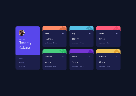
- Use
<a>or<button>for thetimebuttons: Daily, weekly, monthly. (Those on the side) This will let screen reader users to know they are to be clicked. 😉 - Maybe you forgot to set the current
timebutton's color when the page first loads. - I noticed there are repetitive Js code. Maybe, you can create a single function that can replace the showWeekly, showMonthly, etc. For example:
function showCardContent(time, data){
 for (let i = 0; i < cardsTitles.length; i++) {
    currents[i].innerText = data[i].current + "hrs";
    prevs[i].innerText = `Last ${time}- ` + data[i].previous + "hrs";
  }
/*play the animation */
  addAnimationFadeIn();
}
The code above may or may not work but the general idea is there! 😁
Marked as helpful - Use
- @LeoSouzaNunes@A-amon
Hello! To fix your issues, just remove
align-items:center;frombodyelement and setheight:fit-content;onmainelement for mobile size using media queries. 😀Marked as helpful - @Risclover@A-amon
Hello! Great job for this. It looks very responsive too~ 😀
- @vtorre90@A-amon
Hello! Great job~ 😀
Here are few suggestions:
- Use
buttonorradiobuttonelements for the tip selection (Screen reader users won't know it's to be clicked if you use adiv. - Change the
RESETtext toReset. Find out more here 😀 - Instead of using
innerHTMLfor the texts, an alternative would betextContent. You can read about their differences here. But for this current use case, both can be used. 😉 - For the tip buttons' event listeners, there seems to be lots of repeated code. In this case, you can use a single function for them all. For example:
for(const tipBtn of tipButtons){
 tipBtn.addEventListener('click', handleTipClick)
}
const handleTipClick = (event) => {
            let tipValue = 1  // Change it to whatever the default tip value is
            const selectedTip = event.target.value
            if(selectedTip === '5%'){
              tipValue = 5
            }
            let totBill = Number(inputBill.value)/100*tipValue
            let totPeople = Number(nrPersone.value)
            totTipOutput.innerHTML =(totBill/totPeople).toFixed(2) + "€"
}
The code above is written with the assumption that radio buttons are used 😉. Also, it might or might not work but, the general idea is there. 😀
Marked as helpful - Use
- @romariojs94
- @Kristiana12
- @nlorens@A-amon
Hello! Great effort~ 😉
Here are some suggestions( or things I think can be fixed)
- Remove the
heightsetting from.card. Instead, set the height for the image, either in px or other units. I don't recommend usingvhorvwfor this height. 😀 - Remove
topsetting from.card. Then, set thebody's height to100vh. (The card is now at center for any size 🥳) - You are missing
h1andh2elements. Maybe put ah1element containing the challenge's title like<h1> NFT card challenge </h1>and hide it using a screen-reader only 👁 class (You can check these out - Ref1, Ref2. Also, read this to find out about heading tags' usage. - To center vertically, the icon and text inside
.ethand.timerespectively, you can give those two classes this:display:flex; align-items:center;. - Instead of using
position:absolute; right:1.5em;on.timeto align it to the right, maybe you can try outjustify-content:space-between;on.feature. 😉
Awesome work! 😀
Marked as helpful - Remove the
- @Andreeesc
- @martinelias1312@A-amon
Hello! It looks good~ 😀
Maybe just add the
.btnclass to the.btn-sign_updirectly so that the clicking area is as wide as it looks. That's about it from me. 😁Marked as helpful - @SlimBloodworth@A-amon
Hello! Awesome job~ 😀
I've got a few suggestions:
- Set
position:relative;on.image-containerso that the eye icon/image 👁 is center of this parent container. - The clock icon 🕑 isn't vertically aligned with the '3 days left'. You can fix this by setting
display:flex; align-items:center;- Set the
altattribute on your images. I noticed some of them don't have it. You can leave the value empty like this:alt="". 😉 - This might just be me but, the
cursor:pointer;and color change on hover makes the text in.creator-containerlooks like a link so, maybe just change theptag to anatag instead since it's possible for it to be a link. 🔗
Marked as helpful - Set
- @Joe-Lindie@A-amon
Hello! Amazing work there~ 😀
I've got a few suggestions:
- To align the logo and navbar links, you can add this code to your
.nav-bar
display:flex; align-items:center; justify-content:space-between;- I don't think you have set the hover state for your social media links/icons. Anyhow, I would usually use the SVG code itself instead of img for these since I can more freely change the icons' color. You can refer to this 😁
- Looks like your
.display-imgimages couldn't fit inside a row on laptop size. You can fix this by settingflex:1;to your picture tags within instead of settingwidth:25vw;. Then, on mobile, simply use a media query to change that toflex:100vw;. - For your
.shownavbar, you can use media query to override/reset.showstyling on desktop sizes. 🖊 - You should use
<button>for the hamburger button since it's a well, button. 😂 I will let screen reader users to know it's one. Check this out 😉. - The 'Learn More' text should be links 🔗 instead so they should be using
<a>tags. - The social media links should have a text telling screen reader users what each link is for. You can use the
aria-labelattribute on the<a>tags and set it to 'Facebook' or other values, then leave the alt attribute empty (This is what I would do 😀). You can check this out.
Marked as helpful - To align the logo and navbar links, you can add this code to your
- @Mozzarella-chz@A-amon
Hello! You did a great job~ 👏
Just a tiny suggestion, maybe try setting
font-family:inherit;to the button so that it uses same font as the others. As for the margin vs padding, personally, I would use padding for what it is (internal spacing) and margin for external spacing (spaces between the element itself and neighboring elements). Here's a good article explaining the difference. 😉So let's say, I want to have the content of an element to have some spacing from the border, for instance, those
.Luxury-block,.SUV-blockand.Sedan-block, I would set padding to them instead of assigning margin to each individual items (img, .cars-text) inside of them. 😁And if I want to put some spacing between each of those block, I would use margin. For example, a
margin-right:1rem;for a 1rem spacing between.Luxury-blockand.SUV-block. ↔These are just how I would utilize padding and margin. 😀 It might vary between person, I think.
Marked as helpful - @bws10@A-amon
Hello! It looks great. So is the responsiveness~ 😀
Here are few suggestions:
- Wrap your site's main content into a
<main>tag. 🏠 - Have a
<h1>heading. Probably something like this:
<h1 class="sr-only">Order summary component</h1>Note: The
.sr-onlyclass is to hide it from view but still available for screen reader. Here is one way to do it. 😉- Use
<button>or<a>for your 'Proceed to payment" and "Cancel" elements. - After fixing the
<h1>, you can read up on heading levels if you getHeading levels should only increase by oneaccessibility issue 👌
- Wrap your site's main content into a
- @hi-reeve@A-amon
Hello! And wow~ Neat work! 😲
Maybe use
<a>for the .nav__link, .footer__title and .footer__link. And also wrap those social media icons and header logo in<a>tags too. 😀 As for .nav__toggle, use abuttontag.By the way, how did you make the shortening form unclickable when it's shortening? 🤔 I couldn't find the code via Inspect. 😂
Marked as helpful - @dmitrymitenkoff@A-amon
Hello! I gotta say, your code is neat and clean 😉
Here are some suggestions you might find helpful:
- The .daily, .weekly, .monthly
lielements should be/have an interactive element. 🖱 They can bebuttonora. In my solution, I usedbuttonand gave them therole="tab". 😁 You can check out accessible tabs if you want to use the same approach. 😀 - I believe the images for each .stats aren't that important to be made known to screen readers. Hence, instead of "Icon play", etc. , you can leave it empty
alt="". You can read this. 🙌 - I noticed most of the lines in your JS are similar. For e.g.
populateMonthly(),populateWeekly()andpopulateDaily(), you can create a functionpopulateStats()for e.g., to do all three. The difference in these functions lies intimeframes.weekly.currentwhere the weekly could be replaced with daily or monthly. This can be passed as argument to the newly createdpopulateStats(). 😉
function populateStats(timeframe) {
  let datacounter = 0;
  cards.forEach(card => {
    const workHours = card.querySelector('.stats__hrs--num');
    const prevWeekHrs = card.querySelector('.stats__prev__hrs');
    workHours.textContent = data[datacounter].timeframes[timeframe].current;
    prevWeekHrs.textContent = data[datacounter].timeframes[timeframe].previous;
    datacounter++;
  });
}
The code might or might not work. You'll have to test it out and make changes accordingly. 😂
- forEach comes with index, so you don't have to manually create a
datacountervariable to do it. forEach
cards.forEach((card, index) => {
  ...
})
By the way, I finally know what to put into
typography.scss, thanks to you! 😀 Awesome work~Marked as helpful - The .daily, .weekly, .monthly