Not Found
Not Found
Not Found
Not Found
Not Found
Not Found
Not Found
Not Found
Not Found
Not Found
Not Found
Not Found
Not Found
Not Found
Not Found
Not Found
Not Found
Not Found
Not Found
Not Found

Submitted

Updated Toggle Switch

P
Daveโ€ข 5,245

@dwhenson

Desktop design screenshot for the Pricing component with toggle coding challenge

This is a solution for...

  • HTML
  • CSS
  • JS
2junior
View challenge

Design comparison


SolutionDesign

Solution retrospective


I've redone this challenge to try and make the toggle work with screenreaders, it's improved but I've not succeeded as much as I would like.

@grace-snow you mentioned this as an area to improve in my last attempt. Can you, or anyone advise about 'aria-live'? I can only make the reader announce one change not the three prices.

Any other suggestions or comments on any points are most welcome. It was actually more difficult going back to my code and re-working it than just starting afresh in someways!

Community feedback

P
The Burrito Doggieโ€ข 1,260

@BurritoDoggie

Posted

Great work!

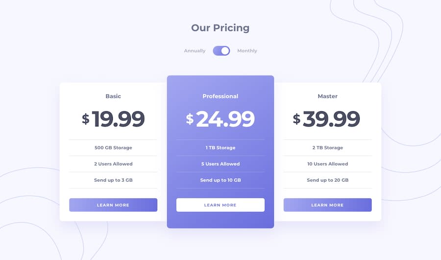
It is definitely cool. I am not good at programing and seeing that Is honestly something I would like to learn. Also when you change the switch to "annually" I like that it has a black circle around it

3

P
Daveโ€ข 5,245

@dwhenson

Posted

Thanks @BurritoDoggie - the black circle was a bit tricky but I wanted people to see what element they were on. I'm glad you like it!

2
P
ApplePieGiraffeโ€ข 30,545

@ApplePieGiraffe

Posted

Hi, Dave! ๐Ÿ‘‹

Redoing a challenge can be pretty interesting, don't you think? (I sometimes get surprised at how I have little to no idea what I was thinking when I look at code that I wrote a few months ago.) ๐Ÿ˜† Anyway, good job! ๐Ÿ‘

I think the dark circle that you added around the toggle-switch for the focused state is good, but if you're working on making the toggle-switch more accessible, perhaps a slightly more obvious focused state (such as a larger outline around the entire toggle-switch) would make the focused toggle-switch easier to see. But IDKโ€”that's just my thought. ๐Ÿ˜…

I'm not super familiar with screenreaders (and even WAI-ARIA and stuff), so I'll just let @grace-snow or someone comment on that if they happen to take a look. ๐Ÿ˜„

Anyhow, as usualโ€”keep coding (and happy coding, too)! ๐Ÿ˜

2

P
Graceโ€ข 27,890

@grace-snow

Posted

@ApplePieGiraffe I'd be really surprised if this wasn't keyboard accessible... Were you perhaps trying to tab instead of using arrow keys?

Looks good dave, I'll have a look properly when I'm more awake โ˜บ

2
P
Daveโ€ข 5,245

@dwhenson

Posted

@ApplePieGiraffe thanks for the feedback - as Grace mentioned you should be able to toggle the switch with the arrow keys. Tab will take you to the next focusable element. I added a fieldset and focus-within to make the selection of the toggle more clear. Thanks as always for the feedback!

1
P
Daveโ€ข 5,245

@dwhenson

Posted

Thanks @grace-snow I tried a bit more but still can't get the aria-live to announce more than one change!

0
P
ApplePieGiraffeโ€ข 30,545

@ApplePieGiraffe

Posted

@dwhenson @grace-snow

Oops! I was hitting my spacebar and Enter keys instead! ๐Ÿ˜… Good work on that (and the updated changes), Dave! ๐Ÿ˜„

1
P
Daveโ€ข 5,245

@dwhenson

Posted

@ApplePieGiraffe Thanks! Yes, this keyboard and screenreader thing is tricky. But you are so right about going back over my own code - really difficult! One thing it's taught me is to take a bit more time at the start and really have a good poke around the design so I know what's needed - trying to bolt stuff on later gets really messy!

1
P
ApplePieGiraffeโ€ข 30,545

@ApplePieGiraffe

Posted

@dwhenson

Definitely! ๐Ÿ˜‚

0
Tesla_Ambassadorโ€ข 2,980

@tesla-ambassador

Posted

Hey Dave, this is a great challenge! I previewed your site and it is some great content because it takes a lot of determination to be able to repeat a project you are done with. Anyways my main suggestions are if you can add some simple animation to your toggle switch and also you might have forgotten to change the color of your body to a light-ish grey. Happy coding!

2

P
Daveโ€ข 5,245

@dwhenson

Posted

thanks @tesla-ambassador for the nice words. Yes! I always for get about background colours! I think it's because I mostly work at night on this and have the colours dimmed! Thanks!

1
Samuel Palaciosโ€ข 615

@samuelpalaciosdev

Posted

Hi, Dave๐Ÿ‘‹

Great job on this challenge. Your solution looks good and scales pretty well๐Ÿ‘

I only suggest decreasing the 'margin-top' of the .container to margin-top: 5em and changing the background-color to a more light-gray color๐Ÿ˜‰

I hope you have a nice day, keep coding!๐Ÿ’™

0

Please log in to post a comment

Log in with GitHub
Discord logo

Join our Discord community

Join thousands of Frontend Mentor community members taking the challenges, sharing resources, helping each other, and chatting about all things front-end!

Join our Discord