


@Alberto-SC
Posted
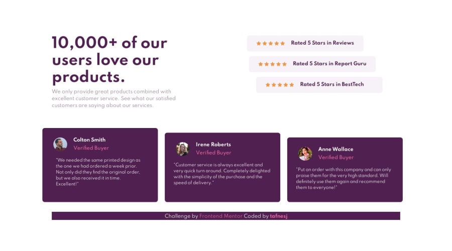
the first div of the stars should be further to the left, otherwise good work
1
Tafnes Jiménez• 3,145
@tafnesj
Posted
@albertosilva123 Thank you for your feedback! I will improve it
5
Looking to hire developers?
I'd like to receive feedbacks from my code. Any comment is helpful regardless of scope.
@Alberto-SC
Posted
the first div of the stars should be further to the left, otherwise good work
@tafnesj
Posted
@albertosilva123 Thank you for your feedback! I will improve it
@ritapetillo
Posted
Hi, good job!
The only thing, I would fix the responsiveness of the layout between width 400px to around 1250px. I can see some problems with both the hero section and the testimonial section below (the boxes alignment and the text inside boxes).
@tafnesj
Posted
@ritapetillo Thank you very much, I will apply this.
@IsamDavid
Posted
Amazing! :')
@tafnesj
Posted
Thank U! :D
@Art-wdt
Posted
Hi! Great job! I like it!
What about using a background pattern? Take a look at the design. Top left.
Join thousands of Frontend Mentor community members taking the challenges, sharing resources, helping each other, and chatting about all things front-end!
Join our Discord


