Submitted 11 months agoA solution to the Social links profile challenge
Using Grid to responsive

@HMQui
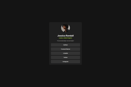
Code
Please log in to post a comment
Log in with GitHubCommunity feedback
- P@makogeboris
Nice work HMQui, here are a few things to review
- All content should be wrapped within landmarks. Wrap a
maintag around card. It's not good practice to wrap every element indivbecause divs aren't semantic. - To improve the semantic meaning of these social media links, you should use the
a(anchor) tag instead of thebuttontag. Theatag is used for navigation to other pages, while thebuttontag is designed for interactive actions like submitting forms or for events like toggling content. Also using an unordered listulto group the social media links is a better approach for both semantics and accessibility. - It's best practice linking Google fonts directly in the HTML
headsection rather than directly in your CSS file as it enables asynchronous downloading, improving page load times. - Consider using a modern CSS reset at the start of the styles in every project. Like this one Modern CSS Reset.
- Font-size should be written in rem not px. This article explains it better Why font-size must NEVER be in pixels.
- Media queries should be defined in
remnot px
Hope this helps
Marked as helpful - All content should be wrapped within landmarks. Wrap a

Join our Discord community
Join thousands of Frontend Mentor community members taking the challenges, sharing resources, helping each other, and chatting about all things front-end!
Join our Discord