Latest solutions
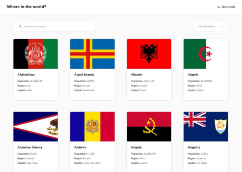
REST Countries API with React Router and Styled Components
#react#react-router#vite#styled-componentsPSubmitted 5 days agoFrontend Quiz app with React Router and Styled Components
#react#react-router#vite#styled-componentsPSubmitted 15 days agoAll feedback is welcome. Thanks!
E-commerce product page with React | Tailwind CSS | Motion
#react#tailwind-css#vite#framer-motionPSubmitted 2 months agoInteractive comments section with React and Tailwind CSS
#react#vite#tailwind-cssPSubmitted 3 months agoPersonal blog with Astro | Tailwind CSS | MDX
#astro#tailwind-cssPSubmitted 3 months agoAll feedback is welcome. Thanks!
Latest comments
- @Dadv-a11yP@makogeboris
Great work.
- P@drewleeWhat are you most proud of, and what would you do differently next time?
This was my first frontend project using Vite as a bundler with TypeScript for the interactivity. I included support for accessibility by providing programmatic focus management and notification changes using a live region.
I've broken up the UI into discrete components. The
app.tsclass is the main "controller" for the application flow, and it stitches together all of the components in a way that keeps them decoupled from each other.P@makogeborisGreat work.
- @GodinhoweversonWhat are you most proud of, and what would you do differently next time?
I'm most proud of using React for the first time. It was a challenge, but I embraced it and pushed through. Overcoming that challenge has been a great accomplishment, and I'm proud of the progress I made.
What challenges did you encounter, and how did you overcome them?One of the challenges I encountered was understanding how to use useState and the logic behind it. I overcame this by thoroughly reading the documentation and experimenting with examples, which helped clarify how it works.
P@makogeborisGreat work
- P@dar-juWhat are you most proud of, and what would you do differently next time?
Made more than necessary. With the solution, can add new products via the database. There is stock control.
What specific areas of your project would you like help with?I couldn't really make the routes work with the GitHub pages - createWebHashHistory is used and I get a redirection to the # page, with createWebHistory the page doesn't load. VUE is new to me, I'd be glad to get comments and edits.
P@makogeborisLooks great
- @OghosaAgbontaenWhat challenges did you encounter, and how did you overcome them?
I HAD DIFFICULTIES MAKING IT RESPONSIVE
What specific areas of your project would you like help with?ANY IDEAS OR TIPS TO MAKE IT BETTER AT BEING RESPONSIVE FOR DIFFERENT SCREEN SIZES
P@makogeborisGreat work, some suggestions
- You could improve your HTML structure by using Semantic elements such as
mainfootersectioninstead ofdivfor better structure and accessibility. Also, you don't need to wrap every element in adiv. - All content should be wrapped within landmarks. Wrap a
maintag around the .container and afooterfor the .attribution. - The add to cart is a
buttonnot ap - Every HTML page must has at least one heading element for better structure, the text 'Gabrielle Essence Eau De Parfum' should be a heading element not
pre - Use the
pictureelement to handle the responsive images effectively like so
<picture> <source media="(max-width: 41.25rem)" srcset="images/image-product-mobile.jpg" /> <img src="images/image-product-desktop.jpg" alt="A Perfume bottle" /> </picture>- It's best to avoid using fixed
heightsandwidthsto ensure your design stays responsive. Instead, try setting the .box width asmax-widthinremunits, and remove theheightproperty altogether. Let the content and padding naturally define the size. Give thebodyamin-height: 100dvh - Font-size, media queries should be written in
remnot px - Consider using a modern CSS reset at the start of the styles in every project. Like this one Modern CSS Reset. This will help reset a list of default browser styles.
Hope this helps, Good luck!
Marked as helpful - You could improve your HTML structure by using Semantic elements such as
- P@BlonoBuccellatiWhat are you most proud of, and what would you do differently next time?
The speed at which I build UIs is increasing, and I am now able to make finer adjustments.
By the third project, I have finally gained enough confidence to consider various aspects, such as which components should have explicit size specifications and which should not.
What challenges did you encounter, and how did you overcome them?Even after building the UI, I was unable to make fine adjustments. This was because I needed to specify the line height using leading-normal instead of relying on the default line height.
In this project, I identified and resolved the issue by carefully inspecting each element with DevTools to find discrepancies.
What specific areas of your project would you like help with?I would like to understand which elements should have explicit size specifications.
In this project, I assigned a specific size to the Card, specified the height for the button, and set its width to w-full.
The reason behind this approach is that child elements should adapt to their parent elements. However, I also considered that buttons should maintain a consistent height regardless of their parent, which is why I explicitly set the height for them.
Does this approach align with best practices? Additionally, is my CSS implementation appropriate?
If you have any insights, I would greatly appreciate it.
P@makogeborisGreat work, generally speaking you shouldn't explicitly set fixed sizes on elements (except for images when necessary) as this can create problems with responsiveness and content fit. Instead, let the content and padding determine the element’s size. If necessary, use
max-widthormin-height, and prefer relative units likeremfor better adaptability.- Your card should have a
max-widthinremand noheight. - For the
buttonsusepaddingto determine its size notheightand to improve the semantic meaning of these links, you should use theatag instead of thebuttontag. Theatag is used for navigation to other pages, while thebuttontag is designed for interactive actions like submitting forms or for events like toggling content. Also, using an unordered listulto group the links is a better approach for both semantics and accessibility. - All content should be wrapped within landmarks. Wrap a
maintag around the card
Hope this helps, Good luck!
Marked as helpful - Your card should have a


