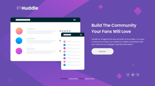
Submitted over 3 years agoA solution to the Huddle landing page with a single introductory section challenge
using HTML, SASS, JS and BEM.
sass/scss, bem

@stebanc
Solution retrospective
I'm trying to write clean HTML and CSS code, so any feedback will be appreciated.
Code
Please log in to post a comment
Log in with GitHubCommunity feedback
- @pikapikamart
Hey, really nice work on this one. The desktop layout looks really great, the site is responsive though I don't really know why at 1260px-ish, it goes to mobile state quickly but I didn't saw any
@mediabreakpoint usage on that one. The mobile state looks great as well.For some suggestions, here are some:
- When using
imgtag, you don't need to add words that relates to "graphic" such as "logo, illustration" and others, sinceimgis already an image so no need to describe it as one. Look at the website's logo as well the hero-section's image. - On this one, the hero-section's image doesn't really give any content at all since if you look at it, it is almost blank with no definite content inside it, meaning it is only acting as decoration. Decorative images should be hidden for screen-reader at all times by using
alt=""andaria-hidden="true"to theimgtag or onlyaria-hidden="true"if you are usingsvginstead ofimgtag. - For each of the
atag of the social-media, you could have only used the social-media's name as the value for thearia-labelsince screen-reader will already announce it aslinkwhen traversingatag so using text that describes that it will redirect user is redundant.
Aside from those, great job again on this one.
Marked as helpful - When using

Join our Discord community
Join thousands of Frontend Mentor community members taking the challenges, sharing resources, helping each other, and chatting about all things front-end!
Join our Discord