@jesuisbienbien

Adrian H
@AdrianX19All comments
- @AdrianX19
Hi @jesuisbienbien!
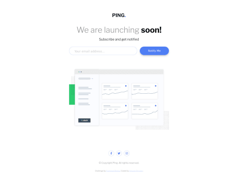
congrats on completing this challenge! really good job! :) The issue you have is caused because <small> elements is an inline and for such elements the top and bottom margin/padding has just not effect, you can do a couple of things to make it working for example you can replace <small> with some block element like <p>, you can change your current element to a block element by adding 'display: block' or you can add margin to your container 'email-error-container' :)
Marked as helpful - @jamespaulmiranda@AdrianX19
Hi @jamespaulmiranda!
Welcome on frontendmentor and congrats for submitting your first challenge! :) a few suggestions:
- to get rid off the accessibility/html issues there are two things you should do, first use semantic tags, so instead of having 'div' for your container use 'main', and instead of having 'div' for your footer, well.. you can use 'footer' tag! :). Second thing is the h3 you used, heading levels shouldn't be used for the styling purpose, it's just not a good practice and we have CSS for that purpose! so changing h3 to h1 and changing the fontsize through CSS would do the trick
- you might consider giving some min-width to your card so it doesn't get squeezed so much with smaller viewport width
- you seem to be lacking the mobile version, you can achieve it on many ways but using media queries it's a good call most of the times! (https://www.w3schools.com/css/css_rwd_mediaqueries.asp) :)
Have a good day! :)
Marked as helpful - @MisterSlimak@AdrianX19
Hi @MisterSlimak!
really good job! If you'd like to get rid off those accessibility issues just replace your container 'div' with 'main' tag :)
- @bigmac369@AdrianX19
Hi @bigmac369!
Congrats on submitting the challenge! A few minor things I've noticed:
- the accessibility issues you have can be solved by changing the #root 'div' to a 'main' tag
- background colour of the join community section is a bit off comparing to the design, it should be white
- monthly subscription text should be aligned to left, to achieve that you should probably set 'align-items' property to 'flex-start' for this section
- the 'monthly subscription' and 'why us' cards should be aligned, I believe you could achieve that by changing justify-content for those cards to 'space-between' and them add the same top and bottom padding for both of them
Keep it up! :)
Marked as helpful - @DonUggioni@AdrianX19
Hey @DonUggioni!
A hover effect for the button would be a nice cherry on top but other than that really nice submit!
- P@DarrickFauvel@AdrianX19
Hi @DarrickFauvel
really good job, well done! I would just try to make the sizes a bit closer to the design, right now the card seem to be pretty narrow, I would suggest increasing the max-width on .card element and I would increase padding for the .card-body, other than that it looks really good! :)
Marked as helpful - @MishalZia@AdrianX19
Hi @MishalZia!
Good job on submitting the challenge! :) Just a couple of small things I've noticed
- the whole layout looks nice but the elements seem to be a bit too small, I would play around a bit with it, alter some widths/heights and font sizes so it more reflects the designs (there is nice chrome extension called 'Pixel Perfect Pro' which will help you to keep your sizes close enough if you don't have access to figmas)
- font colors and font weights seem to be a bit off especially for reviews section, I think customers names should be bold and the opinions itself should be white
- seems like you completely missed the mobile version, if you're not sure where to start this might come in useful: media queries
- @ViicDev@AdrianX19
Hi @PitagoraStrike!
congrats on completing the challenge, really nice job! I've got just some small suggestions:
- your background colour is a bit off comparing to the designs - although I bet you've noticed already ;)
- the width of review cards is a bit too small plus the alignment of the first review and the third review is a bit off (the first card should start where the main text starts and the third card should end where the last stars container ends) - you can easily fix this by changing your justify-content for card containers to space-between
- regarding your accessibility issues, I see in your code that you are using <h4> which seems like you used it just to get smaller font size - heading shouldn't be used for styling, changing it to <h2> and styling in css would be the right approach although in this case I would just use <p>. About the other issues changing divs to semantic tags like <main> and <section> should do or you can just add 'role' attributes to existing divs
Hope you will find the feedback helpful! Happy coding! :)
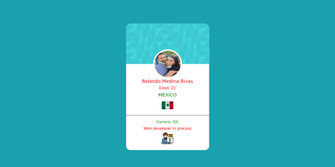
Marked as helpful - @rolando-17@AdrianX19
Hi @rolando-17
Great to see some creativity over here! :)) Congrats on submitting the challenge! Just a few suggestions:
- try to use semantic tags when it's possible, in your case you could for example change the container <div> to <main>
- don't use headings for styling, always start with <h1> and if you need to change how it looks that's where you can use your CSS powers! also not everything should be a heading - there is also <p> tag that can come useful
- your dividing line is too thick I would say and I would suggest using border in this case instead of a <hr> element
- the card background pattern as well as dividing line are sticking out from outside the card a bit, try to play around with width and maybe try using some relative values instead of absolute ones
- you're missing pattern in the main background and the font family is not the one required by design
Hope the feedback helps you a bit! Have a good day
Marked as helpful - @cyberspatial@AdrianX19
Hi @cyberspatial!
The other way to bite this patterns in the background would be to use background-image to the body (it accepts multiple arguments) and then you can use background-position to place the circles wherever you want :) also I would suggest to use <main> tag for your card container instead of a <div>.
All in all really good job! :)
Marked as helpful - @DrunkenNeoguri@AdrianX19
Hi @DrunkenNeoguri,
Good job! if you'd like to get rid of this accessibility issue you can change <div class="namespace"> element to <h1> - keep in mind that if you do so you will have to adjust some styles as well!
Marked as helpful - @ahmed9aks@AdrianX19
Hi @ahmed9aks,
Congrats on completing the challenge, nice job! :) I've got a couple of suggestions, maybe you'll find them useful
- to get rid of your accessibility issues just replace your container <div> with <main> - it's good to get familiar with semantic tags!
- I see you are using h2 for the name, html tag shouldn't be used to style elements so I would suggest to use h1 and style it to your needs
- for your footer try to use justify-content: space-around, that will give you result closer to the designs
- you've got small typo in your CSS inside the media quries: padding: 145px, 25px; the values should not be separated with the comma
Marked as helpful - @mellaniecristine@AdrianX19
Hi @mellaniecristine!
Really great job! There are some minor cosmetic issues like the submit button based on design should have box-shadow right away (not only after the hover), having some transition so the hover effect is better would be nice for the eye ;) and the social media buttons could use some margins - they are really close to each other. Besides those minor issues I really like your submit!
Marked as helpful - @thefolake@AdrianX19
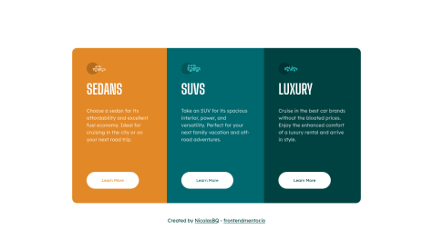
Hi @thefolake!
Congrats on completing the challenge! :) Got a few small suggestion based on your final design:
- on desktop the width of each card seem to be a bit too wide comparing to designs, it looks awesome on mobile so maybe try to play a little bit with it
- you're missing the background colour and hover states, having this would be a nice complement to the final result :)
- instead of handling border-radius with classes for each card separately you can add border-radius just for your parent and then add one extra line overflow: hidden and you will get same result!
- @mellaniecristine@AdrianX19
Hi @mellaniecristine!
Nice job! Just a few small suggestions:
- you can solve you accessibility issues by changing your container 'div' to 'main' - it's worth to use semantic tags!
- I see you set border radius for each card separately, to be more efficient you can add border radius for your parent container and then just add overflow: hidden and you will get same result
- Top padding seems to be a bit too big, maybe try to play with this value a little bit ;)
- I had a look into your css file and noticed that in your media queries you set flex properties for body even tough they are already set - to keep media queries clear it's good to put there only those properties which are changing, no need to repeat same ones :)
Marked as helpful - @NicolasBQ@AdrianX19
Hi @NicolasBQ!
Congrats on completing the challenge! It looks amazing! :)
Just a few small suggestions:
- your background is white which isn't the desired colour
- to make a better user experience you can add transition to your buttons so the change after hovering is not immediate
- I see you use margin top to position your cards but there are better ways, checkout this short video https://www.youtube.com/watch?v=njdJeu95p6s&ab_channel=Fireship
- if you would like to git rid of accessibility issues I would try to change 'article' tag to 'main'
Marked as helpful - @ojitxslml@AdrianX19
Hi @ojitxslml!
Awesome job! If you'd like to get rid of those accessibility issues change your container div to 'main' and remember to provide some value to 'alt' attribute for your images :)
Marked as helpful