


Submitted
One thing I couldn't do
- HTML
- CSS
- JS
I managed to do almost everything. The only thing I can't figure out is the filtering when a filter tag is deleted using the X icon. If anyone has a solution it would be appreciated.
Looking to hire developers?
@AlexGanderton
Submitted
I managed to do almost everything. The only thing I can't figure out is the filtering when a filter tag is deleted using the X icon. If anyone has a solution it would be appreciated.
Submitted
Submitted
Submitted
Find it a little difficult with the position of the computer screen image but overall think it turned out pretty good.
Submitted
I can't figure out why I have got a scroll bar on the desktop version!!! Any feedback would be appreciated.
p.s. I haven't done the hover states yet.
Submitted
This project is a really fun one to implement the dark mode settings and the grid layout of the cards. Really helped me learn a few things better as well. I'd recommend making this to everyone!
Submitted
I couldn't quite figure out how to get the little triangle on the bottom of the storage left area. My guess would be to use an svg of sorts but I'm not quite sure. If anyone has a way of doing it, any feedback will be greatly appreciated!
Submitted
Nice relatively easy challenge with little CSS needed! Feedback is appreciated!
Submitted
Ended up rushing it a bit so it's not perfect, but still think it's a good attempt! Any feedback is appreciated!
Submitted
I feel these challenges are starting to get a little easier as I keep going due to the practice and the change in approach by going mobile-first. Life saver! any newbie who hasn't tried it yet please give it a shot!
Submitted
Really happy with this project and the way it turned out. I even managed to create a custom RegEx to validate the email. Obviously it wont work on every kind of email but just a generic one for this particular project. The first time I've used regex's as well in a project. Any feedback on any parts of the project, good or bad would be much appreciated! Thanks!
Submitted
Mobile-first again and although it was trickier this time I still believe it is a much better approach as it is easier going from small to big than vice versa. I didn't correctly get the position of the image on the desktop version and it still needs some work. I used a grid columns to separate the parts. If anyone has suggestions on how this could be done better I would be very grateful!
Submitted
So in the last few challenges I have struggled to get the desktop version going to mobile. So I did some research and lots of people said that designing mobile-first is the way to go. It made my life so much easier!!! I am going to stick to mobile-first as much as I possibly can in the rest of the challenges and see how it goes.
Submitted
I struggled again with the position of the background objects as well as adjusting the breakpoints to make the mobile version look good. I think it has come out alright in the end.
Submitted
This took me a while to figure out the links section therefore it isn't exactly how it should look. I left the links bar open on the page opening but it can be toggle with the share button.
Submitted
I think this is the best I have done so far. Any feedback on any ways it could be done better/differently are greatly appreciated.
Submitted
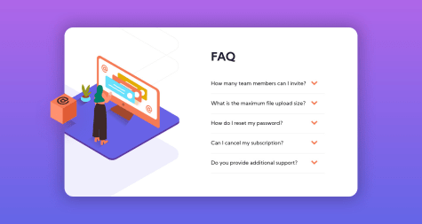
This took me much longer than I thought purely because of the image. I struggled to position it correctly and still do not have the correct position for the mobile screen size, so any feedback in how this could be done better would be very much appreciated!