Skip to content
  • Unlock Pro
  • Log in with GitHub
Profile
OverviewSolutions
26
Comments
10
P
Michael Tze
@Biggboss7

All comments

  • Chris Ekstedt•150
    @cekstedt
    Submitted almost 3 years ago

    Responsive Huddle Landing Page

    1
    P
    Michael Tze•480
    @Biggboss7
    Posted almost 3 years ago

    Hello Chris Ekstedt, Great job on accomplishing this project. You gave the best shot by linking the socmed to the real website :)

    Maybe there are some feedbacks which I can give for you :

    1. The texts of your landing page got pressed in on mobile view (375px). I think it is better to adjust the margin of the body and font-size of the text to be smaller.

    2. Referring to your question about semantic tags on HTML. I notice that in the footer section, you are using <div> as the container to contain the socmed links. I think it is more semantically if you change <div> into <nav>. The code may looks like this :

    <footer> <nav> <ul> <li><a>...</a></li> </ul> <nav> </footer>

    I hope it can be helpful. Happy Coding

  • Draco•160
    @dracowarz
    Submitted almost 3 years ago

    3 Column Preview Card Component Main

    1
    P
    Michael Tze•480
    @Biggboss7
    Posted almost 3 years ago

    Hello @dracowarz, good job on accomplishing this challenge. I think it is better and easier for you to set the media query in bigger range. You can make it "@media only screen and (max-width : 1000px)". So, it is not only fit in mobile, but also on tablet view. Hope it will be useful. Happy Coding

    Marked as helpful
  • Erik•80
    @eriktoger
    Submitted almost 3 years ago

    Rust, Yew, Stylist, CSS

    1
    P
    Michael Tze•480
    @Biggboss7
    Posted almost 3 years ago

    Hello @eriktoger, You did a great job on this challenge. I like how you make the share-link location appears as it is shown in the given design. However, I think that you miss a meta viewport on the HTML head section, which cause the card cannot follow the media query rules.

    Hope it helpful.

    Marked as helpful
  • TripleA•270
    @TRIPLE-ADE
    Submitted almost 3 years ago

    NFT preview card component challenge

    4
    P
    Michael Tze•480
    @Biggboss7
    Posted almost 3 years ago

    Do you mean that you didn't see it on the given design by frontend mentor or you didn't see it after you tried my solution ?

    If you mean that you didnt see it on the given design, try to check it one more time on the this challenge preview site and click on active state. It does exist on the challenge.

    Marked as helpful
  • TripleA•270
    @TRIPLE-ADE
    Submitted almost 3 years ago

    NFT preview card component challenge

    4
    P
    Michael Tze•480
    @Biggboss7
    Posted almost 3 years ago

    Hello @TRIPLE-ADE, Good job on accomplishing this challenge. The NFT Card that you built is great, it is almost resemble the given design from frontend mentor.

    However, I noticed there is one thing missing in your card, which is the eye logo in the middle of the card.

    As the solution from me, maybe you can try this out.

    1. Inside your image container (id="overlay"), put the image "eye logo".

    2. set your image container (id="overlay") to position : relative

    3. set the eye-logo to position : absolute. nb : from step 2 and 3, it will enable your eye logo to be anywhere you like, which the movement is based/relative to the parent container

    4. Move the eye logo until it stands in the middle of your NFT-image

    5. Inside the CSS, set the eye-logo image to hidden

    6. Last, make sure that your eye logo as well as your your background to appear, when you hover through it.

    You can write it like this : #overlay:hover img("the eye logo") { display:inline-block; }

    I hope this solution can be helpful to you. Happy Coding!

    Marked as helpful
  • Sam Ayebanate•130
    @samson123-sys
    Submitted almost 3 years ago

    3-column preview card component

    #airtable#bem
    1
    P
    Michael Tze•480
    @Biggboss7
    Posted almost 3 years ago

    Hello Sam Ayebanate, good job on accomplishing this project. The website you created almost resemble the given design from frontend mentor. In order to make it perfect, maybe you can add the border-radius on the card.

    Marked as helpful
  • ApplePieGiraffe•30,525
    @ApplePieGiraffe
    Submitted about 4 years ago

    Meet Landing Page | Svelte + GSAP | Surprise!

    #svelte#gsap
    17
    P
    Michael Tze•480
    @Biggboss7
    Posted almost 3 years ago

    Very cool !!

  • Bismeet singh•190
    @BismeetSingh
    Submitted almost 3 years ago

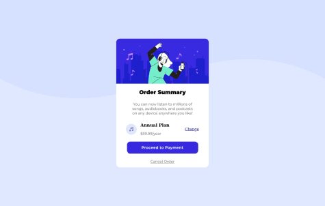
    Order summary page using flexbox

    1
    P
    Michael Tze•480
    @Biggboss7
    Posted almost 3 years ago

    Great job @BismeetSingh on accomplishing this project. You can try to implement --> background-size : contain;, so that the background will be more resemble to the original design.

    Hope it helpful and happy coding

    Marked as helpful
  • Keshav Tulsyan•170
    @codekesh
    Submitted almost 3 years ago

    Stats-preview-card-component

    2
    P
    Michael Tze•480
    @Biggboss7
    Posted almost 3 years ago

    Hello @codekesh, I think you do a great job on this project. Somehow I notice that the border-radius of your main content is not fully displayed. I recommend you to try to put overflow : hidden; on your <main> element. Hope it can be helpful.

  • TripleA•270
    @TRIPLE-ADE
    Submitted almost 3 years ago

    3-column preview card component

    1
    P
    Michael Tze•480
    @Biggboss7
    Posted almost 3 years ago

    Hello @TRIPLE-ADE, Good Job on accomplishing this great challenge. Anyway, I think there are some aspects that you can improve on this challenge.

    1. I think it would be better to build the CSS Styling externally, in another file, outside from HTML file. It will make the code cleaner.

    2. If you want, you can make your main section appears precisely in the middle of the body, by : a. add, min-height : 100 vh; in the body section, it will make your body section to appear full page

    b. put in the body section display : flex; flex-direction : column; justify-content : center; align-item : center;

    I hope this feedback has been useful to you! keep coding :)

Frontend Mentor logo

Stay up to datewith new challenges, featured solutions, selected articles, and our latest news

Frontend Mentor

  • Unlock Pro
  • Contact us
  • FAQs
  • Become a partner

Explore

  • Learning paths
  • Challenges
  • Solutions
  • Articles

Community

  • Discord
  • Guidelines

For companies

  • Hire developers
  • Train developers
© Frontend Mentor 2019 - 2025
  • Terms
  • Cookie Policy
  • Privacy Policy
  • License

Oops! 😬

You need to be logged in before you can do that.

Log in with GitHub

Oops! 😬

You need to be logged in before you can do that.

Log in with GitHub

Oops! 😬

You need to be logged in before you can do that.

Log in with GitHub

Oops! 😬

You need to be logged in before you can do that.

Log in with GitHub

Oops! 😬

You need to be logged in before you can do that.

Log in with GitHub

Oops! 😬

You need to be logged in before you can do that.

Log in with GitHub

Oops! 😬

You need to be logged in before you can do that.

Log in with GitHub

Oops! 😬

You need to be logged in before you can do that.

Log in with GitHub

Oops! 😬

You need to be logged in before you can do that.

Log in with GitHub

Oops! 😬

You need to be logged in before you can do that.

Log in with GitHub

Oops! 😬

You need to be logged in before you can do that.

Log in with GitHub

Oops! 😬

You need to be logged in before you can do that.

Log in with GitHub

Oops! 😬

You need to be logged in before you can do that.

Log in with GitHub

Oops! 😬

You need to be logged in before you can do that.

Log in with GitHub

Oops! 😬

You need to be logged in before you can do that.

Log in with GitHub

Oops! 😬

You need to be logged in before you can do that.

Log in with GitHub

Oops! 😬

You need to be logged in before you can do that.

Log in with GitHub

Oops! 😬

You need to be logged in before you can do that.

Log in with GitHub

Oops! 😬

You need to be logged in before you can do that.

Log in with GitHub

Oops! 😬

You need to be logged in before you can do that.

Log in with GitHub

Oops! 😬

You need to be logged in before you can do that.

Log in with GitHub

Oops! 😬

You need to be logged in before you can do that.

Log in with GitHub

Oops! 😬

You need to be logged in before you can do that.

Log in with GitHub

Oops! 😬

You need to be logged in before you can do that.

Log in with GitHub

Oops! 😬

You need to be logged in before you can do that.

Log in with GitHub

Oops! 😬

You need to be logged in before you can do that.

Log in with GitHub

Oops! 😬

You need to be logged in before you can do that.

Log in with GitHub

Oops! 😬

You need to be logged in before you can do that.

Log in with GitHub

Oops! 😬

You need to be logged in before you can do that.

Log in with GitHub

Oops! 😬

You need to be logged in before you can do that.

Log in with GitHub

Oops! 😬

You need to be logged in before you can do that.

Log in with GitHub