


Submitted
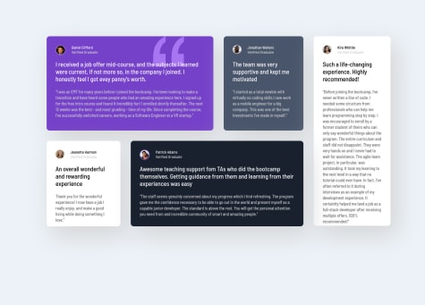
Four-Card-Feature-Section
- HTML
- CSS
First the things I did I used a lot more semantic markup than I ever have. Instead of too many DIVS I used <main>, <section> and <article> I added the media query for the mobile look, and it appears to be working ok.
Issue My main issue is responsive CSS. I have stayed away from PX as much as I can. I have been using %, VH, VW, MIN/MAX width etc. However I am still having issues with its responsiveness.
  With this project, it goes out of whack when I zoom in or out. It looks ok at 100% zoom, but it does not look right when zooming in or out.

   What is the trick for this? While my CSS understanding has grown I am clearly having some issues understanding it fully