Skip to content
  • Unlock Pro
  • Log in with GitHub
Profile
OverviewSolutions
9
Comments
8

Maria Valentinova Ivanova

@MariaValentinova220 points

I’m a mysterious individual who has yet to fill out my bio. One thing’s for certain: I love writing front-end code!

I’m currently learning...

CSS, Tailwind, Bootstrap, JavaScript

Latest solutions

  • NFT preview card component challenge with Tailwind


    Maria Valentinova Ivanova•220
    Submitted over 1 year ago

    0 comments
  • Huddle landing page with single introductory section using HTML, CSS


    Maria Valentinova Ivanova•220
    Submitted over 1 year ago

    0 comments
  • Fylo landing page with two column layout solution


    Maria Valentinova Ivanova•220
    Submitted over 1 year ago

    1 comment
  • FAQ accordion

    #bootstrap

    Maria Valentinova Ivanova•220
    Submitted over 1 year ago

    0 comments
  • Product preview card component

    #bem

    Maria Valentinova Ivanova•220
    Submitted over 1 year ago

    0 comments
  • QR code component


    Maria Valentinova Ivanova•220
    Submitted over 1 year ago

    0 comments
View more solutions

Latest comments

  • Guilherme Fernandes Vidotti•520
    @Vidottizzz
    Submitted over 1 year ago

    FAQ accordion with HTML, CSS, Javascript

    3
    Maria Valentinova Ivanova•220
    @MariaValentinova
    Posted over 1 year ago

    Hi, there! I personally took advantage of all the default functionalities of Bootstrap to create the accordion and control its behavior. You can look at my code in case it is helpful to you. You can achieve closing the previously opened item when opening a new one by keeping track of the currently opened item and closing it before opening the new one. Here are some suggestions to implement this in your code: 1.Create a global variable to track the currently opened item. You can initialize it with null initially since no item is open at the beginning. Like: let currentItem = null; 2.Modify the showhide and hideshow functions: When opening an item, check if there is currently an open item (currentItem is not null). If there is one, close it before opening the new item. When closing an item, update the currentItem variable to null.

  • Eugenia Antonova•430
    @EugeniaAntonova
    Submitted over 1 year ago

    Responsive faq section

    #accessibility
    1
    Maria Valentinova Ivanova•220
    @MariaValentinova
    Posted over 1 year ago

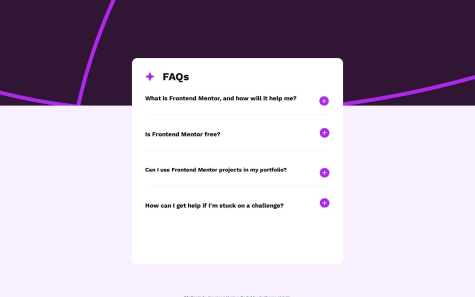
    Hi there! I don´t see the assets/images/icon-star.svg that should be before the FAQ´s title.

    Marked as helpful
  • mhykah•220
    @mhykah-webdev
    Submitted over 1 year ago
    What are you most proud of, and what would you do differently next time?

    Wasn't too hard!

    What challenges did you encounter, and how did you overcome them?

    I had to review how to change images based on media queries

    What specific areas of your project would you like help with?

    Semantic html, best practices that I might be missing.

    Product preview card component

    2
    Maria Valentinova Ivanova•220
    @MariaValentinova
    Posted over 1 year ago

    Great job! Did you do this with access to figma? It's just excellent 👌 I think you could merge this part: /*

    1. Use a more-intuitive box-sizing model. */ *, *::before, *::after { box-sizing: border-box; }

    /* 2. Remove default margin */

    • { margin: 0; } or you didn't want to get margin: 0 to after and before? If you adjust the margin you have in the card and the button "Add to card" it will be exactly the same as the design.
  • Andreas Koch•60
    @andreaskdk
    Submitted over 1 year ago

    Tailwind qr code component

    1
    Maria Valentinova Ivanova•220
    @MariaValentinova
    Posted over 1 year ago

    Hi there! The image is not displaying, nor is it centered. I experienced this too and had to adjust the paths.

    Marked as helpful
  • Abbas Sher•480
    @Abbassher55
    Submitted over 1 year ago

    Blog card design using tailwind css

    #tailwind-css
    1
    Maria Valentinova Ivanova•220
    @MariaValentinova
    Posted over 1 year ago

    Hi there! I find this to be very well executed. Perhaps a few minor details could be fine-tuned, such as the yellow background being cropped when scaled below 320px, and in my opinion, the font-weight needs adjustment. For someone starting, I think this is excellent work! It's been challenging for me to pinpoint areas for improvement. This showcases the work of someone with a promising future, in my opinion.

    Marked as helpful
  • vcgmuse•70
    @vcgmuse
    Submitted over 1 year ago

    Blog Card - @Media Multi Screen Only HTML, CSS

    3
    Maria Valentinova Ivanova•220
    @MariaValentinova
    Posted over 1 year ago

    I think you could optimize your code. I don't understand why you're accommodating so many screen size options. In the documentation, it says it's intended for mobile screens of 375px and desktops of 1440px, I believe. This way, there would be much less code. You should pay more attention to proportions: border-radius, and margins. Good use of the CSS flex property!

    Marked as helpful
View more comments
Frontend Mentor logo

Stay up to datewith new challenges, featured solutions, selected articles, and our latest news

Frontend Mentor

  • Unlock Pro
  • Contact us
  • FAQs
  • Become a partner

Explore

  • Learning paths
  • Challenges
  • Solutions
  • Articles

Community

  • Discord
  • Guidelines

For companies

  • Hire developers
  • Train developers
© Frontend Mentor 2019 - 2025
  • Terms
  • Cookie Policy
  • Privacy Policy
  • License

Oops! 😬

You need to be logged in before you can do that.

Log in with GitHub

Oops! 😬

You need to be logged in before you can do that.

Log in with GitHub

Oops! 😬

You need to be logged in before you can do that.

Log in with GitHub

Oops! 😬

You need to be logged in before you can do that.

Log in with GitHub

Oops! 😬

You need to be logged in before you can do that.

Log in with GitHub

Oops! 😬

You need to be logged in before you can do that.

Log in with GitHub

Oops! 😬

You need to be logged in before you can do that.

Log in with GitHub

Oops! 😬

You need to be logged in before you can do that.

Log in with GitHub

Oops! 😬

You need to be logged in before you can do that.

Log in with GitHub

Oops! 😬

You need to be logged in before you can do that.

Log in with GitHub

Oops! 😬

You need to be logged in before you can do that.

Log in with GitHub

Oops! 😬

You need to be logged in before you can do that.

Log in with GitHub

Oops! 😬

You need to be logged in before you can do that.

Log in with GitHub

Oops! 😬

You need to be logged in before you can do that.

Log in with GitHub

Oops! 😬

You need to be logged in before you can do that.

Log in with GitHub

Oops! 😬

You need to be logged in before you can do that.

Log in with GitHub

Oops! 😬

You need to be logged in before you can do that.

Log in with GitHub

Oops! 😬

You need to be logged in before you can do that.

Log in with GitHub

Oops! 😬

You need to be logged in before you can do that.

Log in with GitHub

Oops! 😬

You need to be logged in before you can do that.

Log in with GitHub

Oops! 😬

You need to be logged in before you can do that.

Log in with GitHub

Oops! 😬

You need to be logged in before you can do that.

Log in with GitHub

Oops! 😬

You need to be logged in before you can do that.

Log in with GitHub

Oops! 😬

You need to be logged in before you can do that.

Log in with GitHub

Oops! 😬

You need to be logged in before you can do that.

Log in with GitHub

Oops! 😬

You need to be logged in before you can do that.

Log in with GitHub

Oops! 😬

You need to be logged in before you can do that.

Log in with GitHub

Oops! 😬

You need to be logged in before you can do that.

Log in with GitHub

Oops! 😬

You need to be logged in before you can do that.

Log in with GitHub

Oops! 😬

You need to be logged in before you can do that.

Log in with GitHub

Oops! 😬

You need to be logged in before you can do that.

Log in with GitHub