Latest solutions
Newsletter sign-up form with success message using HTML, CSS and JS
#accessibility#fresh#web-components#webflow#animationSubmitted about 2 years agoOrder summary card design (HTML, CSS (Flexbox technique)
#accessibility#webflow#freshSubmitted over 2 years agoPricing Component Design (HTML, CSS, JS)
#accessibility#animation#fresh#styled-components#webflowSubmitted over 2 years agoStats preview card component - Easy design using CSS Flexbox technique
#accessibility#fresh#webflowSubmitted over 2 years agoTime tracking dashboard - functional and responsive (HTML, CSS, JS)
#accessibility#animation#fresh#webflowSubmitted over 2 years agoExpenses chart component - functional and responsive
#accessibility#animation#fresh#webflowSubmitted over 2 years ago
Latest comments
- @khushi0909@Mariusq17
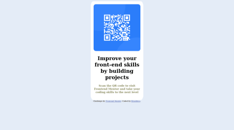
Try to put at body
min-height: 100vhto make the body to align the card to center on the entire screen.Marked as helpful - @ratul0407@Mariusq17
I don't think it's a correct way to make your projects. At begging any way to work is correct !
It's a nice work, but I think the color of paragraph maybe be something darken (it's hard to see) => maybe
p { color : var(--clr-neutral-300); }will work.To make responsive , you need to use media quires for change the font-size , padding and some units at card width or height, but if you don't know to use media queries, I think using min-width instead of width at card size (main) will help.
I hope this message will be helpful ! 💪


