Skip to content
  • Unlock Pro
  • Log in with GitHub
Profile
OverviewSolutions
21
Comments
16
Mayen
@Mayen007

All comments

  • Sara-Mousa•120
    @Sarah-Mousa
    Submitted 6 months ago
    What are you most proud of, and what would you do differently next time?

    This time, I managed to focus on everything I've learned before especially JS code, it took time but I could do it.

    What challenges did you encounter, and how did you overcome them?

    JavaScript actions weren't that easy for me, but I wasn't in a hurry. I spent the time needed to finish it.

    What specific areas of your project would you like help with?

    How to think well to write a JS code.

    Newsletter-sign-up form

    #accessibility
    1
    Mayen•440
    @Mayen007
    Posted 5 months ago

    Hey! Your project turned out great. Try changing the background to match the design.

  • Vee•20
    @veesesh
    Submitted 5 months ago
    What are you most proud of, and what would you do differently next time?

    ff

    What challenges did you encounter, and how did you overcome them?

    fff

    What specific areas of your project would you like help with?

    ff

    gtg

    #accessibility#angular#angular-material#express#animation
    1
    Mayen•440
    @Mayen007
    Posted 5 months ago

    Hey, can you retry submitting your project?

  • Shikur•140
    @shikurassefa
    Submitted 6 months ago
    What are you most proud of, and what would you do differently next time?

    the most proud of is keep going forward.for the next time i will finish my css coding journey on frontend mentor.

    What challenges did you encounter, and how did you overcome them?

    when i design for the desktopview i cant code like the given design. i need help also

    What specific areas of your project would you like help with?

    as i mentioned above i need help on desktopview

    Results-Summary-Component using flex and grid css techniques

    1
    Mayen•440
    @Mayen007
    Posted 6 months ago

    Great work so far! To better align the desktop design with the intended layout, consider reworking the container structure. Currently, using two separate containers is fine, but introducing a parent container will help unify the layout and match the design more closely.

    Here are two approaches you can take:

    Media Queries: Use a parent container to define a default layout (e.g., for mobile) and adjust it for desktop using media queries. For instance:

    .parent-container {
        display: flex;
        flex-direction: column; /* Mobile layout */
    }
    
    @media (min-width: 768px) {
        .parent-container {
            flex-direction: row; /* Desktop layout */
        }
    }
    

    Flex-wrap: If using flex-wrap, the parent container can automatically adjust the child elements to stack or align as needed:

        .parent-container {
            display: flex;
            flex-wrap: wrap;
        }
    

    Both methods ensure the design transitions seamlessly between layouts while maintaining a cohesive structure. This will not only simplify your CSS but also make the layout more responsive and easier to manage!

  • P
    Cosmin Buzuloiu•60
    @cbuzuloiu
    Submitted 6 months ago

    Blog Previe Card

    1
    Mayen•440
    @Mayen007
    Posted 6 months ago

    Your project looks fantastic—well done!

    A few things for your consideration:

    1. Using semantic HTML could enhance your code's structure and accessibility.
    2. Switching to responsive units for your containers can improve adaptability across screen sizes. Keep up the great work!
    Marked as helpful
  • EliasSekandaR•50
    @EliasSekandaR
    Submitted 6 months ago
    What are you most proud of, and what would you do differently next time?

    I am proud that I finished this project in 1 hour and I am excited to do more project in coming days.

    What challenges did you encounter, and how did you overcome them?

    the challenges I faced was;

    1. to import fonts to the CSS which I used "@font-face".
    2. I forgot how to create variables in CSS, I searched it and found out how to create and call Variables in CSS. I used variables for initializing colors in this project.
    What specific areas of your project would you like help with?

    Inter font .ttf file has long name with special characters which cause for "@font-face" to not work.

    SOCIAL LINKS PROFILE MAIN

    2
    Mayen•440
    @Mayen007
    Posted 6 months ago

    Your @font-face declaration looks fine, but ensure the .ttf file name matches exactly, and there are no special characters in the file name. If the current file name is long or has special characters, consider renaming it to Inter-Regular.ttf. Also, double-check that the file path ./assets/fonts/static/Inter-Regular.ttf is correct relative to your CSS file.

    Marked as helpful
  • Zeey76•200
    @Zeey76
    Submitted 6 months ago

    Contact Form

    1
    Mayen•440
    @Mayen007
    Posted 6 months ago

    Great work!

  • ShadowCoder040•70
    @ShadowCoder040
    Submitted 6 months ago
    What are you most proud of, and what would you do differently next time?

    I am proud that it looks very similar to the original solution.

    What challenges did you encounter, and how did you overcome them?

    It was the first small project I did without tutorials and copying code from tutorials, so I had to figure out the flexbox, essentially what's the parent what's the child, etc. to make sure the container is centered.

    QR Code project with CSS Flexbox

    1
    Mayen•440
    @Mayen007
    Posted 6 months ago

    Hey @ShadowCoder040! Your project turned out great, especially for your first small project—awesome work! 🎉

    That said, there’s an opportunity to improve responsiveness for smaller screens. I noticed your container width is set to 340px, which means it won’t adjust properly for screens narrower than that. A more flexible approach would be to combine a default width with a max-width defined as a percentage of the parent container. This allows your design to adapt more smoothly to varying screen sizes.

    Here’s an example you could try:

    .container {
      width: 90%; /* Default width relative to the viewport or parent */
      max-width: 340px; /* Prevents the container from growing too large */
      margin: 0 auto; /* Centers the container */
    }
    

    This technique ensures the container fits smaller screens while maintaining a consistent maximum size for larger displays.

    By implementing these tweaks, your layout will look great on a wider range of devices. Keep up the amazing work, ShadowCoder! 🚀

    Marked as helpful
  • Kanashii•40
    @everyonehateskanashii
    Submitted 6 months ago

    QR Code Component

    #pure-css
    1
    Mayen•440
    @Mayen007
    Posted 6 months ago

    Hey Kanashii! Great job so far—you’re making fantastic progress! Here are a few observations and suggestions to help refine your project further:

    Repository Access

    I noticed that I don’t currently have access to your repository. Sharing the repository or hosting a live preview would make it easier to review your code and provide more specific feedback. Consider sharing a GitHub link or deploying your project to a platform like GitHub Pages, Netlify, or Vercel for better accessibility.

    Responsiveness Issues

    I observed that your card layout isn’t fully responsive on screens 375px wide and below. This might be because the container’s width is fixed or not adaptive enough. To improve this, try setting the container’s width using percentages or a max-width with relative units like em or rem. Here's an example:

    .container {
      width: 90%; /* Allows for flexibility */
      max-width: 400px; /* Ensures it doesn’t grow too large */
      margin: 0 auto; /* Centers the container */
    }
    

    Additionally, verify that any padding or margin doesn’t add unnecessary width beyond the viewport. Utilizing CSS properties like box-sizing: border-box can help ensure your layout calculations are accurate.

    Great work so far, Kanashii—your efforts really show! Let me know if you update the repository or need help with anything specific. Happy coding! 😊

    Marked as helpful
  • Kamal Alhejaili•60
    @Kamalep
    Submitted 6 months ago
    What are you most proud of, and what would you do differently next time?

    I am proud of the first web page challenge, it takes around 5-7 days. the next time I'll do it on a day

    What challenges did you encounter, and how did you overcome them?

    the challenge was how to make media query, especially how to make image fit, I'm not finished yet,

    What specific areas of your project would you like help with?

    how to make the image fit on media query

    Owner avatar recipe-page-main using responsive page

    #foundation
    2
    Mayen•440
    @Mayen007
    Posted 6 months ago

    Hey Kamal! Your work is coming along beautifully—great job so far! Here’s some feedback to make your project even better:

    Image Responsiveness

    I noticed that your image overlaps the recipe container. To address this, you can make your image responsive by setting its width to 100% so it adjusts to the width of its parent container. This ensures that your image scales naturally and maintains its aspect ratio.

    Here’s an example CSS snippet you can use:

    img {
      width: 100%;
      height: auto; /* Maintains aspect ratio */
    }
    

    This approach eliminates the need for media queries to handle responsiveness in most cases.

    Simplifying the Markup

    It looks like the container-img div isn't adding much value to the structure. You can simplify your HTML by removing it and applying the necessary styles directly to the image element. This makes your code cleaner and easier to maintain.

    Keep up the fantastic work, Kamal, and happy coding! 😊

    Marked as helpful
  • P
    eMKa18•90
    @eMKa18
    Submitted 7 months ago

    Pure HTML + CSS + JS

    1
    Mayen•440
    @Mayen007
    Posted 6 months ago

    Great work on this! You're really on the right track, but there's always room to polish the design a little more. Let's dive in!

    1. Responsiveness

    You're doing a solid job with responsiveness, but I noticed that setting width: 100vw on the body/html can cause horizontal scrolling on small screens (like 375px and below). This happens because the browser sometimes includes the width of the scrollbar in the viewport calculation.

    To fix this, try one of these:

    • Option 1: Add this to prevent padding/margins from expanding the width:

      * {
        box-sizing: border-box;
      }
      

      This makes sure padding and borders don’t affect the total width of elements.

    • Option 2: You can switch to using width: 100% on both html and body, which avoids the scrollbar issue on smaller screens.

    These small tweaks will clean up the horizontal scrolling problem and keep the design nice and responsive!


    2. Submit Button

    You're doing great with your button, but I noticed a noticeable white border that isn't in the design. This can be easily fixed by removing the border:

    button {
      border: none;
    }
    

    That'll bring it more in line with the intended design!

    Keep up the awesome work—you're doing fantastic! These tweaks will only make it even more polished.

    Happy Coding!

    Marked as helpful
  • Sara-Mousa•120
    @Sarah-Mousa
    Submitted 7 months ago
    What are you most proud of, and what would you do differently next time?

    I started to fix my errors alone, also i learned how to style the type of ul list away from the text.

    What challenges did you encounter, and how did you overcome them?

    none

    What specific areas of your project would you like help with?

    none, next time I will try bootstrap

    Recipe Preview

    #accessibility
    1
    Mayen•440
    @Mayen007
    Posted 7 months ago

    👏

  • P
    Gillian Oliveira•260
    @lia-oliveira
    Submitted 7 months ago
    What are you most proud of, and what would you do differently next time?

    I am proud of having managed to finish it with quality in less time than the previous ones, even without having the Figma file.

    If I were starting now, I would probably use CSS Grid combined with Flexbox because I believe it would make positioning the elements easier and faster.

    What challenges did you encounter, and how did you overcome them?

    It was a layout that was essentially in lines. I challenged myself to use only Flexbox to solve it. I had to watch some classes and consult references on how Flexbox works. I asked questions to the GPT Chat mainly about how relative measurements work. Several sources of reference.

    What specific areas of your project would you like help with?

    This particular project is pretty straightforward. I think I just need to practice more by doing other projects.

    Responsive Social Links Profile using HTML and CSS Flexbox

    #accessibility#pure-css
    1
    Mayen•440
    @Mayen007
    Posted 7 months ago

    👏

  • Kairung Vangmanaw•260
    @VangmanawKairung
    Submitted 7 months ago
    What are you most proud of, and what would you do differently next time?

    I'm most proud of how I successfully applied semantic HTML5 markup, Sass for better CSS structure, and responsive design techniques to make the project look great on various screen sizes. Using mixins to streamline styling in Sass was a key highlight for me, and I also feel accomplished in balancing the layout with Flexbox, ensuring a clean and functional design. Next time, I would focus more on optimizing my workflow by planning ahead for potential improvements in interactivity—maybe by integrating some JavaScript for dynamic content. I would also consider experimenting with CSS Grid for more complex layouts, to continue expanding my skill set.

    What challenges did you encounter, and how did you overcome them?

    One of the biggest challenges I encountered was making sure each element's size matched the design precisely. At first, it was tricky to get everything aligned and scaled correctly, especially when balancing padding, margins, and responsive adjustments. To overcome this, I carefully analyzed the design requirements and experimented with different unit types, ultimately settling on rem for consistency. I also relied heavily on Chrome's developer tools to inspect and adjust each element in real-time, ensuring they met the design specs. This process taught me the importance of precision and patience when working with design measurements.

    What specific areas of your project would you like help with?

    I would love to get more insights on improving accessibility in my projects, especially when it comes to ARIA labeling. Although I’ve used basic alt text and role attributes, I want to ensure that my components are as accessible as possible for all users, including those who rely on screen readers. Additionally, I’d appreciate guidance on writing more advanced @mixin rules in Sass, as I see a lot of potential in using them for cleaner, more reusable code. Learning best practices for both accessibility and Sass techniques would really help me level up my development skills.

    Blog Preview Card by HTML and CSS (Sass)

    #sass/scss#accessibility
    1
    Mayen•440
    @Mayen007
    Posted 7 months ago

    Great design implementation!

  • Sara-Mousa•120
    @Sarah-Mousa
    Submitted 7 months ago
    What are you most proud of, and what would you do differently next time?

    I did it in a short time , usually I used to spend many hours to finish a small project

    What challenges did you encounter, and how did you overcome them?

    fixing the width according to the content.

    What specific areas of your project would you like help with?

    I need to know the method of choosing the proper font size measurement.

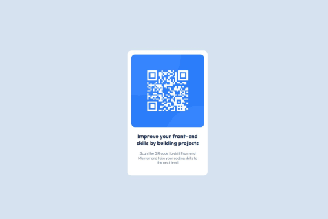
    QR code Preview using HTML & CSS

    #accessibility
    2
    Mayen•440
    @Mayen007
    Posted 7 months ago

    Choosing the proper font size measurement. I found this to be helpful. Maybe check it out. https://www.wix.com/studio/blog/font-size

    Marked as helpful
  • webwalacoder•100
    @webwalacoder
    Submitted 7 months ago
    What are you most proud of, and what would you do differently next time?

    Just testing my front-end skills...

    What challenges did you encounter, and how did you overcome them?

    Fluid Typography concepts are complicated and most of the development time was spent on font-size responsiveness and tried my best to get closest to the given design...

    Edited: Made changes to the product preview card to make it more responsive adding breakpoints and enhanced font styling...

    What specific areas of your project would you like help with?

    Feedback and code reviews are appreciated...

    Responsive product preview card using HTML and CSS

    2
    Mayen•440
    @Mayen007
    Posted 7 months ago

    Great design! One thing that needs improvement is the width of the image and the text part. On some screens the image appears distorted, with the text part taking majority of the space available. Otherwise it's a great design implementation.

  • Kaiji67•20
    @Kaiji67
    Submitted 7 months ago
    What are you most proud of, and what would you do differently next time?

    Easy challenge I think, don't have anything to change I guess

    What challenges did you encounter, and how did you overcome them?

    Too easy to be challenging

    What specific areas of your project would you like help with?

    Nothing I guess

    QR code solution

    1
    Mayen•440
    @Mayen007
    Posted 7 months ago

    Great work! A few things I would like to point out, 1) Its not responsive from 320px.Solution is try using a responsive width for the container, so that it adapts to various screen sizes. Something like a max-width: 20rem; works fine. 2) The font is slightly different from the challenge.

    Marked as helpful
Frontend Mentor logo

Stay up to datewith new challenges, featured solutions, selected articles, and our latest news

Frontend Mentor

  • Unlock Pro
  • Contact us
  • FAQs
  • Become a partner

Explore

  • Learning paths
  • Challenges
  • Solutions
  • Articles

Community

  • Discord
  • Guidelines

For companies

  • Hire developers
  • Train developers
© Frontend Mentor 2019 - 2025
  • Terms
  • Cookie Policy
  • Privacy Policy
  • License

Oops! 😬

You need to be logged in before you can do that.

Log in with GitHub

Oops! 😬

You need to be logged in before you can do that.

Log in with GitHub

Oops! 😬

You need to be logged in before you can do that.

Log in with GitHub

Oops! 😬

You need to be logged in before you can do that.

Log in with GitHub

Oops! 😬

You need to be logged in before you can do that.

Log in with GitHub

Oops! 😬

You need to be logged in before you can do that.

Log in with GitHub

Oops! 😬

You need to be logged in before you can do that.

Log in with GitHub

Oops! 😬

You need to be logged in before you can do that.

Log in with GitHub

Oops! 😬

You need to be logged in before you can do that.

Log in with GitHub

Oops! 😬

You need to be logged in before you can do that.

Log in with GitHub

Oops! 😬

You need to be logged in before you can do that.

Log in with GitHub

Oops! 😬

You need to be logged in before you can do that.

Log in with GitHub

Oops! 😬

You need to be logged in before you can do that.

Log in with GitHub

Oops! 😬

You need to be logged in before you can do that.

Log in with GitHub

Oops! 😬

You need to be logged in before you can do that.

Log in with GitHub

Oops! 😬

You need to be logged in before you can do that.

Log in with GitHub

Oops! 😬

You need to be logged in before you can do that.

Log in with GitHub

Oops! 😬

You need to be logged in before you can do that.

Log in with GitHub

Oops! 😬

You need to be logged in before you can do that.

Log in with GitHub

Oops! 😬

You need to be logged in before you can do that.

Log in with GitHub

Oops! 😬

You need to be logged in before you can do that.

Log in with GitHub

Oops! 😬

You need to be logged in before you can do that.

Log in with GitHub

Oops! 😬

You need to be logged in before you can do that.

Log in with GitHub

Oops! 😬

You need to be logged in before you can do that.

Log in with GitHub

Oops! 😬

You need to be logged in before you can do that.

Log in with GitHub

Oops! 😬

You need to be logged in before you can do that.

Log in with GitHub

Oops! 😬

You need to be logged in before you can do that.

Log in with GitHub

Oops! 😬

You need to be logged in before you can do that.

Log in with GitHub

Oops! 😬

You need to be logged in before you can do that.

Log in with GitHub

Oops! 😬

You need to be logged in before you can do that.

Log in with GitHub

Oops! 😬

You need to be logged in before you can do that.

Log in with GitHub

Oops! 😬

You need to be logged in before you can do that.

Log in with GitHub

Oops! 😬

You need to be logged in before you can do that.

Log in with GitHub

Oops! 😬

You need to be logged in before you can do that.

Log in with GitHub

Oops! 😬

You need to be logged in before you can do that.

Log in with GitHub

Oops! 😬

You need to be logged in before you can do that.

Log in with GitHub

Oops! 😬

You need to be logged in before you can do that.

Log in with GitHub

Oops! 😬

You need to be logged in before you can do that.

Log in with GitHub

Oops! 😬

You need to be logged in before you can do that.

Log in with GitHub

Oops! 😬

You need to be logged in before you can do that.

Log in with GitHub

Oops! 😬

You need to be logged in before you can do that.

Log in with GitHub

Oops! 😬

You need to be logged in before you can do that.

Log in with GitHub

Oops! 😬

You need to be logged in before you can do that.

Log in with GitHub

Oops! 😬

You need to be logged in before you can do that.

Log in with GitHub

Oops! 😬

You need to be logged in before you can do that.

Log in with GitHub

Oops! 😬

You need to be logged in before you can do that.

Log in with GitHub

Oops! 😬

You need to be logged in before you can do that.

Log in with GitHub

Oops! 😬

You need to be logged in before you can do that.

Log in with GitHub

Oops! 😬

You need to be logged in before you can do that.

Log in with GitHub