Skip to content
Explore
For companies
Unlock
Pro
Log in
with GitHub
Profile
Overview
Solutions
9
Comments
3
MaziluRO
@MaziluRO
Follow
All solutions
Tip Calculator
MaziluRO
•
180
Submitted almost 4 years ago
0 comments
1 like
Social media dashboard using Sass and grid
MaziluRO
•
180
Submitted almost 5 years ago
0 comments
1 like
Flexbox Sign-up
MaziluRO
•
180
Submitted almost 5 years ago
0 comments
3 likes
Flexbox Sign-up
MaziluRO
•
180
Submitted almost 5 years ago
1 comment
1 like
Responsive testimonials using flexbox
MaziluRO
•
180
Submitted almost 5 years ago
0 comments
2 likes
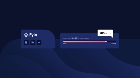
Fylo challenge using flex-box
MaziluRO
•
180
Submitted almost 5 years ago
2 comments
1 like
Article preview with flexbox and color variables.
MaziluRO
•
180
Submitted almost 5 years ago
0 comments
3 likes
Base Apparel using Bootstrap
MaziluRO
•
180
Submitted about 5 years ago
2 comments
1 like
I used only CSS to complete the challenge
MaziluRO
•
180
Submitted over 5 years ago
3 comments
0 likes
Oops! 😬
You need to be logged in before you can do that.
Log in
with GitHub
Oops! 😬
You need to be logged in before you can do that.
Log in
with GitHub
Oops! 😬
You need to be logged in before you can do that.
Log in
with GitHub
Oops! 😬
You need to be logged in before you can do that.
Log in
with GitHub
Oops! 😬
You need to be logged in before you can do that.
Log in
with GitHub
Oops! 😬
You need to be logged in before you can do that.
Log in
with GitHub
Oops! 😬
You need to be logged in before you can do that.
Log in
with GitHub
Oops! 😬
You need to be logged in before you can do that.
Log in
with GitHub
Oops! 😬
You need to be logged in before you can do that.
Log in
with GitHub
Oops! 😬
You need to be logged in before you can do that.
Log in
with GitHub
Oops! 😬
You need to be logged in before you can do that.
Log in
with GitHub
Oops! 😬
You need to be logged in before you can do that.
Log in
with GitHub
Oops! 😬
You need to be logged in before you can do that.
Log in
with GitHub
Oops! 😬
You need to be logged in before you can do that.
Log in
with GitHub
Oops! 😬
You need to be logged in before you can do that.
Log in
with GitHub
Oops! 😬
You need to be logged in before you can do that.
Log in
with GitHub
Oops! 😬
You need to be logged in before you can do that.
Log in
with GitHub
Oops! 😬
You need to be logged in before you can do that.
Log in
with GitHub
Oops! 😬
You need to be logged in before you can do that.
Log in
with GitHub
