@mateusAbdallah

P
MELT
@MeltedGreenVelvetAll comments
- P@MeltedGreenVelvet
Good job on completing your first challenge! You should be proud of yourself.
My suggestions:
- I'd recommend looking into flexbox! It'll help out with general alignment issues, including responsivity. It makes building a layout so much easier.
- I feel that your QR image should be set at a higher percentage, possibly at a 100% with some padding/margin usage. Setting the QR image smaller than it needs to be will affect UX (user experience).
- I know readmes can be a pain to write, but I always recommend writing them for completed repos, even partially if you don't have everything you need for a fully fleshed out README.md. Documentation is very important in the development world! Not saying hiring managers or recruiters will examine every inch of your github, but not having a README.md is a red flag to them. Plus, it's good practice for both yourself and for teammates. Your future self will thank you!
Marked as helpful - @SuBTHaiP@MeltedGreenVelvet
I think your solution is looking great, and congratulations on your first challenge! I hope you enjoyed it, and you continue to put out other completed challenges as well!!
I have a few suggestions:
-
Vertical alignment is a pain. On my display, your component is not vertically aligned. In this case, utilizing flexbox would be the easiest option. Not to mention, if you get comfortable using flexbox, you'll have more flexibility with other forms of alignment in future projects as well.
-
If you were to check #D3D3D3 (light gray) against #FFF (white), you'll find that the color contrast is at a 1.50, which is calculated as "very poor" in terms of web accessibility. This means that the font color is hard to read, especially for folks that have disabilities. There are color contrast checker web apps that are great for this. The standard is at least a 4.5:1 ratio. This is more of a web design thing, but important if you decide to change the color of the given design's font. I installed a Chrome extension called Slick Color Picker that lets me color pick straight from the webpage. It's helpful in situations where I don't know the exact color of something. It gives you the exact hex code you need for your code. (It's also great if you enjoy digital art and graphic design!!)
-
I see that you have a mix of inline and external CSS, plus an empty internal style tag. Using solely external CSS is best practice. It improves website performance and efficiency. On a more human level, external CSS is viewed as more organized. If you were to have a large website with many webpages and lots of styling, inline CSS would quickly get confusing, especially for those on your team who didn't create the original code.
-
The universal selector is VERY handy. I can definitely understand why you'd pick that one to define your default styling. But, it's also hefty. It can slow the rendering of your webpages, so it's best to use it sparingly. It interrupts CSS inheritance, and you may have to write more CSS to account for that. A body selector, instead of a universal selector, would be great to define default styling.
I hope my suggestions are helpful and make sense! Let me know if not!!
Marked as helpful -
- @James143rinkuP@MeltedGreenVelvet
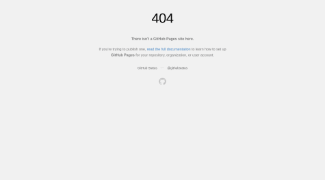
Oh, I had that 404 error when deploying my first repo too. I did the same exact thing you did.
Moving the contents out of your initial "qr-code-front-end-mentor" directory, and then deleting that directory, was what got rid of my 404 error. Maybe that will solve yours as well.
Also, whenever someone is reviewing your code, they tend to go to the README.md first. The viewer of your code will get an understanding of what you want accomplished, what you learned, the resources you utilized within your code, etc. I only see the README template uploaded. I'm not sure if that is accidental, but a customized README would be a great addition to your solution.
Marked as helpful - @coderook229P@MeltedGreenVelvet
On my monitor, your container is not centered horizontally or vertically, so that's why it's not lining up as it should in the design comparison screenshot. The alignment is significantly off when I visit your preview site. Have you considered utilizing flexbox? I feel that it's so much easier to perfectly and responsively center a container that way, and you'll have more flexibility with other forms of alignment in the future.
Other than the alignment issue, I feel that your component looks great!!
Marked as helpful - @NTWayysP@MeltedGreenVelvet
"Where / how can I learn HTML markup?"
I've been enjoying Scrimba. MDN, Freecodecamp, and W3Schools are classics. MDN and W3Schools are great for checking syntax in my opinion. As I work, if I come across an issue that I'm unable to solve myself, I immediately google my question and seek out Stack Overflow.
"Will come back to this one day, when I figure out google fonts and such."
Google Fonts generates the CSS/HTML code automatically. Select your font style and weights you need, copy the generated code, and paste directly into your CSS/HTML files.